Monday Morning Art Completes

Thanks for following the Monday Morning Art posts here, and the Twitter tweets with the associated hashtag.

With the end of the 2015 calendar year, and 20 posts under my belt, I'll stop here for now.  It's been fun digging into the details of a bunch of artists, some well-known, others not so much.  It has also been fun to expound on their works, influences and their evolution as artists over their lifetimes.

Alfred J Casson "White Village" (1938)

My analyses carry no weight beyond that of just-another-observer.  If you disagreed with me or found a comment annoying - that's great.  (This one really pissed people off for a while here in Ottawa.) 

That is what art is for - invoking opinions and debate about ideas, images, and perspectives. Warm thoughts and happy sighs are just part of the opinion/experience spectrum.  I hope there was a little bit of all-of-the-above here for you.

Jackson Pollack's "Lucifer" (1947)

If a comment or two helped someone look at a piece a little bit differently, or introduced someone to a work or artist they didn't know before, that is reward enough.


Maurits Cornelis Escher's Cat (1919)

Monday Morning Art #20: Edvard Munch

This week's Monday Morning Art extravaganza comes by request.  As the artist behind one of the most recognizable paintings of the past 150years, Edvard Munch was certainly on the radar for future attention, but with the request of Melissa (aka @eastcoastknits) I've bumped him up to debut on this pre-Xmas twitter-art episode today.

Before he produced his pivotal piece(s) in the final decade of the 19th century, Munch plied his craft through the usual processes of realism that matures into more personalized expression.  There are often interesting hints of what is to come in such early works.

The Norwegian artist explored his style under the influence of his contemporaries or course, and later some influential time in Paris. At times his pieces drift into echoes of Renoir (Sick Child), Pissaro (River at St. Cloud) or Manet.

This early (1883) portrait of a young woman kindling a fire is a nice piece that could as easily be an Andrew Wyeth from 80 years later.  He captures the figure lovingly and freezes the moment very well, with the hint of orange warmth radiating out from the growing fire in the stove.


There is an on-going interest in the bold diagonal element to his compositions, sometimes evocative of Degas.  Indeed his portrait of Writer Hans Jaeger is quite evocative of the famous "Glass of Absinthe."  A look over many of Munch's works show the dominant diagonal to guide the viewer's eye.


But soon Munch layers his representational semi-impressionist compositions with a surrealist edge and a despair that creates a deeper level of interest.


His self portrait as a young man of 22 in 1886 reveals a more visceral quality.  The contrasts and the expression captured are of a combined defiance and ambition.


In the 1890s Munch is in his prime as an artist, producing many notable pieces.  Sure, a few sunsets - this one appearing very much like a Monet sketch, but other pieces hint at troubled times.


He approaches the pivotal year of 1893 when is likely troubled by mental illness difficulties and will reflect that in a few pivotal pieces.

The bridge over a fjord serves as a backdrop for many Munch pieces. One must consider the symbolism in the bridge - perhaps stretching between normality and despair, positive and negative, humanity and nature.

His painting "Despair" touches on what is to come the next year.  It likely depicts the same incident he describes later as the situation of his 'Scream" work. He says he was unspeakably tired under a red sky, stopping on the bridge over the fjord. In a feeling of desperation, and as his friends continued to walk on he saw the vibrant sunset and the blue waters, and felt that nature itself was screaming out to him.


In 1893 he creates his first version of "The Scream" in a pastel drawing.

He recreates the piece in 1895 as a pastel again, and then in various other media over the coming years.   The 1893 version is shown here.   The '95 was sold recently for almost $120M.  The rest of the versions remain in Norwegian museums where they are apparently periodically stolen, with minor damage.

While Munch later describes himself as "quite mad" for several years after this period, he still manages to produce interesting pieces.  This landscape of is from 1899 and is very evocative of a Monet sunset.

He has some exhibit success and positive regard from his shows.  He lives in Paris in the late 1890s - how could that not but have a positive affect on an artist? What a time to be alive, and what a place to be.  He returns to Norway, and travels to Italy, and has a somewhat stable relationship. Spoiler alert - it doesn't last, ends badly, with rivalries, gunshots and and injured fingers, apparently, in the process.

But still some interesting work. Isn't it always the way with troubled artists.  His portrait of a Fisherman in 1902 is an interesting work. The colours and light are quite engaging.

He had both popular and financial success with pieces depicting a sick child as well.


I also enjoyed this landscape from 1903 of "The Forest" where he seems to feel something akin to what Emily Carr puts into her work in the decade that follows.


Following this are even more troubled years for the artist, with heavy drinking and brawling a part of his life, and continued descriptions of paranoia, but finally some concerted attention to therapy as well. There are somewhat positive results with treatment in Munich and a return to Norway in '09 sees an improvement in his ability to work.

Edvard Munch continues to interweave works of despair and angst in works like "Nude I" in 1913 and "The Murderer" of 1910 with more pastoral scenes of workers in a forest (The Lumberjack 1913) and "History" from 1911.

The first war is difficult for him, with mixed loyalties between his love for France and friends in Germany.   He contracts, but survives the pandemic Spanish Flu of 1918. 

I like his work "The Wave" from 1921 particularly.  He captures still sometime malevolent in a strong onshore wind, but also the dazzling colour of the landscape.


Munch lives to 1944 and dies in

Monday Morning Art #19 - Emily Carr

I wonder what it would've been like to pop into Emily Carr's home in Victoria in the late 1930s?  I suspect she was a curmudgeonly old lady.  Born in 1871 (her birthday by wild coincidence was yesterday).   Then again, as her health waned, and her effort turned to writing, the results were very sensitive and thoughtful pieces, so perhaps she was a kindly old soul.

Regardless, the works she created were never devoid of emotion and power.   Working through the end of Post Impressionist influences into a modernist, at times surrealist feel, she holds a valued place in Canadian art.  Usually 'Monday Morning Art' starts with a bit of mystery, and a 'can you guess this artist' query.   Not much challenge at guessing this artist.

To launch the tweet stream under that hashtag, I led with perhaps her most Van Gogh-esque piece to throw the viewers off a little bit.

This image at left is her "Above the Gravel Pit" from 1937. A bit strange that this piece is so similar to a Vincent work, that late in her painting career.  Would have expected that much earlier, perhaps while she studied in France?

Getting ahead of myself, perhaps.  Let's look at her life in painting.

 Carr really has two periods of painting in her life.  In her early years, after some time studying art in San Francisco as a teen,  she went off to live in England for 8 years, and a couple of years painting in France as well.  The influence of Cezanne was strong in her Parisian circle of friends.  Perhaps not a surprise in this Breton Church piece (1906).

Carr returns to Canada permanently in 1911.

Her early work had already turned to depicting scenes from aboriginal villages and vestiges in the British Columbian province of her home.   

An interesting element of her depictions of the aboriginal presence in the landscape is how the totem poles and villages appear to fit into their environs.  There's a sense of harmony, for example in this piece " Totem Walk at Sitka" (1907) where the totem poles alternate with tree trunks along the forest path.


The totem poles among a village at "Gitwangak, Queen Charlotte Islands" (1912) depicts the figures of the carved totems in harmony with the residents of the space, under a living sky, in vibrant colours clearly influenced by the post impressionist perspective.  


Indian Church, 1929 shows another perspective. The western church sits in a foreboding and over-powering forest.  One gets the sense that the building exists almost ephemerally in its landscape and overpowered by the rain forest, which could erase it at its slightest whim.


When people showed little enthusiasm for her modernist-leaning pieces, she mostly gave up painting for a time, between about 1913 and 1927.

But, perhaps my favourite work from Emily Carr comes from during that time. Her "Arbutus Tree" (1922) captures a great sense of the unique BC landscape, arching over the tiny elements of the local humans.

When I visited the province it was the arbutus tree that was one of my memorable moments, seeing the orange-fleshed forms along the road in the sunlight was a special part of the experience.

When encouraged to start showing again in 1927, she had a bigger impact than she had earlier experienced. This was especially so when she gained attention of the National Gallery in an exhibit of west-coast art.  Making contact with Lawren Harris and others in the  Group of Seven Canadian artists was also a big influence.   

Perhaps it was Harris' influence that had her gradually evolve into broader landscape subjects, and there is certainly some cross-fertilization evident in the work in this latter period of her life.

One British analyst considering a recent prominent exhibit in London had an interesting point to make.  She is not a pretty artist, was his point.  True, there is a malevolence in some of this work that almost makes more sense with our modern perspective of humanity's impact on the natural environment.

Her "The Mountain" from 1933 captures a bit of this.  With the tiny village below the looming mass of the landscape.  This one makes me think a bit of the "Frank Slide" of 1903, and how the planet can erase the presence of humans with the slightest shrug.


Her health waned with heart attacks in '37 and '39, and strokes shortly thereafter.  Carr's efforts turned to writing in the early '40s, with several well-regarded works produced both then and posthumously.  (Carr's "Book of Small" for example.)

Emily Carr died in 1945 at the age of 73.

Well known and respected across Canada in the late 20th century and beyond, recent sales of her works command millions of dollars at auction.


Monday Morning Art #18 - Paul Klee

The early 20th century is such a dramatic time for art. Perhaps the most change-filled era in the entire history of art.  All the rules are broken. Indeed, pushing the boundaries of what is art and what are the boundaries seems to be at the core of the change.  Surely the two World Wars are pivotal in that.   The inter-war period is full of agony at the losses of the first war, hope for the future, then foreboding of what was yet to come.

In this era Swiss-German painter Paul Klee emerges.  Originally pushed towards music, by his music-teacher father, and singer mother, the compulsively sketching youth evolves into a pivotal figure in visual art.

He's 21 at the turn of the century, just completing a fine arts degree in Munich, and then moves off with friends to study the old masters in Italy.

After a few years of carousing he marries, and then fails at being a magazine illustrator.  Said to struggle with successful use of colour, Klee will later have a pivotal experience to suddenly make it work for him.   "The Artist at the Window" is a 1909 self-portrait I quite like from his early work.  It's recognizably him, but has layer of distortion and focuses on the interplay of dark and light more than the forms.

When he joins another publication, he there meets Wassily Kandinsky and a key piece of the Klee future is in place.  Kandinsky's strength in abstraction, and pushing the boundaries of art, is influential on many artists, let alone those close to him.

Klee delves further into the abstract. Remember we're at the end of the impressionist era, and moving parallel to the more broadly pleasing and populist Art Nouveau that emerged from the commercial art of the time

In 1914 Klee has a pivotal trip to Tunis and is inspired by the light and colour of the place that quickly takes over his life. 

"Color has taken possession of me; no longer do I have to chase after it, I know that it has hold of me forever... Color and I are one. I am a painter." - a pithy quote attributed to the artist, gleaned from Wikipedia.

His piece "In the style of Kairouan" is the first that comes out of that experience.


In the first war he is conscripted into the German infantry, but his work continues to explore the abstract.

A well known piece of his emerges in his military years - this one is "The death of the Idea" from 1915.   Interesting too, is that while Klee avoids combat, he is involved in painting camouflage on airplanes.  Another influence, perhaps, on his style?


I wonder too about the influence of Klee's sense of identity on his art.  Even though born in Switzerland he isn't granted citizenship until after his death.  In his genre, not too far removed from what we'd today sometimes call "outsider art," one wonders if that disconnection with one's homeland is a key element.


He works at the famous Bauhaus school with Kandinsky for a decade, and there works with bookbinding, stained glass, and mural workshops. 

The stained-glass connection is one I see constantly in his work.  From the vibrant light-infused colours to the heavy contours. 

His "Woman in a Peasant Dress" at right, is a 1940 work, the last year of his life, but is very indicative of his stained-glass-like pieces. 


And the prescient Klee creates a piece called "The Twittering Machine" from 1922.   How can I help but post this picture to Twitter?   Turn the crank and we tweet, retweet and like?


Klee was experimental with his media as well. Using both watercolours and oils in a single piece, but also things like jute, and wallpaper paste and newsprint.

His sense of exploration and capturing child-like simplicity while layering in profound ideas of life, death and society are often commented upon in analyses.  At the end of the day though, abstract art, and naive art in particular is in the eye of the beholder.  It is, for some, easy to dismiss an abstract piece as simplistic, but this is the perennial criticism of work that is fundamental and game-changing. 

Once it has been created, it seems obvious and (on the surface) even trivial. However the ability of the artist to conceive the work, and present it to us, and the fact that nobody had previous had 'that' to say, is where the depth and talent is embodied.


In the lead up to WWII, experimental and abstract art is not well received by Hitler's minions. With the rise of Nazis power, Klee's art is branded "degenerate" by the ever-tolerant and pleasant powers that be.  More than 100 of his works were siezed by the Nazis. 


The three-panel piece in vibrant oranges and earth tones is "Temple Gardens" from 1920.  The landscape elements and buildings are only hinted at here.  It's colour and geometry that take centre stage.  The colours are again vibrant and probably representative of the setting sun's light.   The colours too might remind one of a Cezanne landscape or Gaugain's depictions of sunlit scenes in Tahiti.


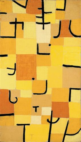
Perhaps my favourite piece from Klee is his "Characters in Yellow" (1937) shown a the left.

These look to me like Japanese characters and in that the work is rather suggests to the European audience anyway - look, here is something that is using a new vocabulary.

It's a visual vocabulary of colour and shape. Or at least the building blocks of a vocabulary, like the letters which build a word or a phrase.  The palette of warm oranges and yellows contrasting with the black lines (more stained-glass influences?) and say something different than if he used another part of the colour spectrum, and chose other characters. What the colours say to you, and what the characters say to someone else, each viewer is different, and brings a different set of experience, culture and knowledge to a situation.


Clothing manufacturers for years have borrowed from the Klee body of work. Probably almost as much as they do from Mondrian.


The other, related, thing that keeps striking me is that his art should be adopted by a quilt manufacturer.   Indeed, modern quilt makers are often rather decent artists in their own genre.  The colour, abstraction and geometry used by Klee a century ago must surely appeal to people that work in that art form.

There are many examples I'd like to pull up around my ears on a cold night.  At left is "Red Balloon" from 1922


Klee dies in 1940, from an degenerative tissue disease that gradually saps his strength and ends his life.  He still creates some important pieces in his final year.   His music-teacher father also died that year, I notice, though I don't see any detail about the timing between the two events.

Paul Klee's  "Chosen Site" from 1940 is another strong piece from his final year.  A landscape composed of the sorts of forms and colours he explored in earlier years and a heavy red sun at the end of the day perhaps.  His colours are much more muted here, from those years of glowing vibrant stained-glass-like compositions.

Klee leaves an amazing legacy - a large number of completed pieces and a style that continually evolved.  One has the sense of flood of inspiration that he would never manage to get through exploring before time ran out.