Monday Morning Art #12 - A. J. Casson

By 1926, the increasingly-poorly named Canadian "Group of Seven" artists added Alfred J Casson to the mix.  The Toronto-born Casson, then working as a commercial artist (at the same firm as Frank Carmichael) was invited to show at an event with the other members.  Frank Johnston had left the group a few years earlier, so there was a numeric opportunity at least.

Stylistically, there was also a good affinity, and Casson fit right in.

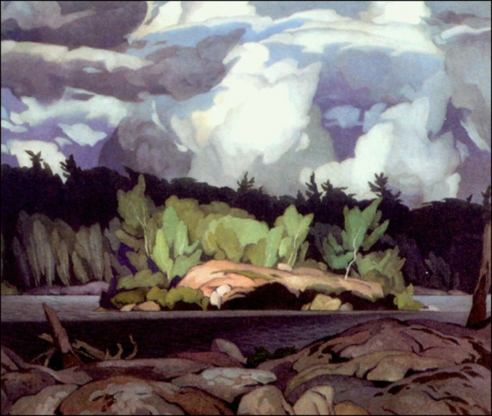
This landscape sketch captured near Rosseau, in the Muskoka region shows his chops. 

Besides painting the landscapes of Ontario's 'Near North' and further towards Lake Superior, the small Southern Ontario towns and their architecture were one of Casson's favourite subjects.

Some of his views of rural buildings and simple structures reminds me of Edward Hopper. (See my MoMoArt#3 on Hopper)  Certainly the magical lighting effects, and the stylized, simplified details are evocative of Hopper's work. In Casson's work the landscape is always and important element there as well.

This piece is an "Anglican Church at Magnetawan" and besides the brightly illuminating sunshine, there are the sculpted, somewhat ominous trees, a distant treeline and the river in view.


This piece, the Store at Salem also has a Hopper-esque feel to me. While the clouds and rocks and shaded contours are reminiscent of what Lauren Harris was doing too.


Ultimately, the organized Group of Seven artists disbands in 1932 - though Casson as the youngest of the group is still in his prime. He begins the "Canadian Group of Painters" in 1933. But with Harris, Carmichael, Lismer and Jackson on board, it's clearly just a (better-named) reconstitution of the same crew.  (The Canadian Group on Wikipedia. Oh look, Varley, Carr etc too).

The graphics and screen-printing aesthetic of Casson's background comes through in his work. This one of "The White Village" is a good case in point.

There, the golden trees are towering over the buildings, and the water and rocks in the foreground place the houses squarely in nature.  Figures are rare in his work - all the personality coming from the landscape. 

I shouldn't skew this too much toward the views of small towns, as his trips into the northern bush are a key part of his work.  Casson did many views of Moose lake as well. 

This piece is simply "Moose Lake." 


http://www.artcountrycanada.com/images/casson-ragged-sky-moose-lake.jpgHere is his a more dramatic, less controlled view of the "Ragged
Sky at Moose Lake" as well. It's a bit more wild and lively.


Back in the urban landscape, there are a pair of pictures from around 1927 that stick with me.


These are the rooftops-in-the-snow pictures that capture well the cold, crisp, sunny days in the neighbourhood, familiar to urban Canadians. 


The colour in this image of his "Rooftops of the Ward" might be a little skewed into the orange from the original, but a winter warmth comes through that is very appealing there. 

His "Rooftops" in this second image has a somewhat different style. It's reminiscent of some of the Quebec artists of the time (perhaps Marc-Aurele Fortin).

Alfred Casson played an important part in the development of Canadian art in the Twentieth Century, without doubt.  It's the cross-fertilization of styles from the other artists of the time that is particularly appealing. 

Unlike many of the others at the time, Casson did not have a prolonged European period in his development, as far as I'm aware (though I haven't researched that in any thorough way).  Many other members of the Group of Seven and the Canadian Group had, as part of their education, some time spent painting in France. Some had been born in the UK and had some exposure to the artists of that area.

Casson picked up Impressionist and Nouveau influences once removed from that scene. Perhaps that helped allow him to carve out his own unique melange of those elements.

I'll wrap up with his "General Store" (he found many 'stores general' to serve as subjects).  This one intrigues me somewhat because of the magical background of ghostly blue shapes, reminiscent of Emily Carr's work. 


The piled-up twilight clouds are not unlike Carr's rainforest tree-shapes. Again, structures dropped into a dramatic landscape.  One gets the feeling of these outposts of humanity finding a foothold in the wilderness, but tolerated rather than dominating their environment.  


Monday Morning Art #11 - Tom Thomson

It's a bit cliché for a Canadian to haul out Tom Thomson pictures in their art tribute, but how can we resist? His works capture something of the soul of this country. And (hopefully) most Canadians grow up having seen his work thousands of times. Hopefully most learn his name, or at least remember his work or style.

Interestingly, Thomson only really starts painting seriously after about 1912, when he visited Algonquin park.  But he did apparently learn to paint and draw as a younger person.  There are a few pedestrian portraits of ladies in suitably Victorian garb.  I found this ink sketch from 1905 of a Young Fisherman to be one of his early good pieces.  And it hints at his future obsession - landscape, fishing and the interaction of people with nature.


Probably the most iconic of Thomson's works is Northern River (1915).  The vertical lines, the silhouetted spruce trees. and the glow beyond over the river epitomizes the Thomson view of the mysterious landscape.

For me it puts me squarely into a spot I knew as a kid growing up in the northern landscape. A favourite path off into the bush, where the next city in that direction was probably Moscow over the other side of the North Pole.

The tangle of the brush and red leaves underfoot could only be captured by someone who had been there.


His piece "The Pool" from the same year catches that moment when everything is red and orange, just before it has all turned to black and white.


 There's a chill in that water that is palpable. You'd feel it splashed on your hands as you pushed your canoe into the little lake to pick up your route on the other side.

It's election day here in Canada, as I pulled together this Monday Morning Art spewing of pictures on Twitter, and it makes me think of what the Thomson legacy says to us. I keep coming across symbolism and ideas I might not have thought up had it not been election day.  I offered Thomson's "Twisted Maple" as a bit of a kick-off for the my Monday art stream.


Again, it's an autumn scene.  Thomson liked to capture this time of year. Sure he has other works, like A Summer Day which depicts the big blue skies and fluffy clouds of another season. But often he'd use the colour of his Masonite panel in the work to provide the hue for the reddish purple leaves in his composition.  Autumn gave him lots of opportunity to do that.

Much of Thomson's sketch work (and the 'Group of Seven with which he is closely associated) used small plywood or Masonite panels of about 27 by 21cm, on which he would paint an image on both sides. 

It creates a challenge for galleries hanging his work. Some rotate the panels every few days or weeks. Others display them in two-sided glass cabinets so we can see both pictures.


 The sketchy quality of the pieces adds to their appeal. In the quick capture there is an immediacy and an immersion into the landscape that you might not get from another artists more larger, more polished piece. 

Much of the landscape Thomson and the group of Seven painted was often burned over by fires that would sweep across the boreal forest unchecked. Occasionally there work was in cut-over lands as well. 

These somewhat denuded landscapes expose the rocky Canadian shield, like the bone structure of the region.  Like the meandering rocky sections of the shield, the burns also afforded the artists vistas that would otherwise have been obscured by trees.

It's the visceral 'like-being-there' sense of the bush that captured most in the Thomson paintings.  And for those of us living in that environment, or growing up with it, it is always "the bush" and never the forest or the wilderness.  Those terms were always giveaways that you were from down south, in a city somewhere.

The authenticity captured in Thomson's work shows him to be 'of the land' in that it connected with him, and he knew how to live in it. I suspect if I ran across Thomson in a canoe on some northern lake and talked around a cooking fire on an exposed chunk of granite, he'd only use the term 'bush' too.

This view of the birches in "Early Spring" (1917) was in the spring of his last year. Sadly he was found dead in July of 1917, in Canoe Lake.  And while it was ruled an accidental drowning, there were also hints of murder or suicide. There is much written on the topic, and so I'll leave that to the many theorists.  I think though that it is unlikely Thomson would have willingly left this world. With the prolific and inspired work of his last five years, it's unlikely that he would have seen his work as anywhere near finished yet. 

I regret that there are many would-be paintings that we never got to see.


Monday Morning Art #10 - Maurits C. Escher

Born at the end of one of the most dramatic centuries in art history, Maurits (aka Mauk) Escher was a contemporary of Salvador Dali and René Magritte, and there are certainly some similarities to those artists in some of his early works. No doubt they were cross-influenced at numerous stages in their careers.

Escher has difficulty in academics and focuses on illustration. In the beginning his work with centres around portraits, figures and landscapes. And a few cats.  But his chosen media drives his style and fosters a later interest in patterns and line that is quite profound. The stark blacks and whites lead him to an early exploration of shapes. 

This early piece is called "Twon Tree" (1919) takes a simple landscape, but departs from realism and turns tree branches into a swirling, surrealist pattern that explores the geometric. 


But for another two and a half decades, Escher's work is well grounded in reality.  His landscapes and buildings are sharpy captured, with strong lighting and perspective.


He does a number of works around Italy, from the Amalfi coast, to rural mountain villages in Tuscany.  The stark lights-and-darks of the tower faces in "San Gimignano" (1923), capture the village just south of Florence, are are captivating with their drama 


This untitled village (1930) nestled in the mountains is a striking asymmetric composition.

There is an underlying hint of magical realism gained from unusual angles and somewhat organic, amorphous shapes.

A pivotal piece for me is this one called "The Bridge" from 1930. Presumably this is on the Amalfi coast, where he was painting many scenes at the time.  The combination of three things appears to be important:
  • The unusual angle
  • the complexity of the blocks of houses, and 
  • the geometry of the staired-bridge, and the adjacent stairs on the buildings. 


This surely leads him towards some of his best-known works of impossible staircases,  like the House of Stairs in 1951 and the famous "Relativity Lattice" (1953), shown here.


 Across his career, Escher also likes to explore the impact of unusual optical effects on an image. He does several self portraits based on looking at himself in a spherical lens.  Here is a rough montage of five of those portraits.  Beginning in the top left, the years of creation are: 1921, 1934, 1935, 1946 and 1950. 


By the time we're into the late 1940s and '50s, Escher's work is almost completely exploration of geometric patterns, eye-twisting illusions and fascinating negative/positive space interconnections. Flying FishLizards or Butterflies for example - all fitting together perfectly in a pattern. 

To wrap up, I thought this very Internet-friendly image of a cat, from Escher's early years (1919) captures a bit of his earliest thinking about negative and positive space.  This appears to be a woodcut, leaving the artist the challenge of representing fuzzy fur with only lines. The result is very successful indeed.


Monday Morning Art #9 - Edgar Degas

Perhaps one of the top three or four names of the Impressionist and Post-Impressionist movement, Edgar Degas is one of those instantly recognizable artists.   His dancers, situated in obliquely viewed rooms, or on the stage, with upward-projected footlight illumination are iconic.

Perhaps most use of those images today are to adorn a young girl's bedroom wall.  Some sort of epitome of femininity or girlishness, but Degas is also known for capturing the gritty, challenging life of the stage performer and dancer. From his many back-stage semi-nudes, to the sad faces of down-and-out people; the less beautiful part of the Belle Époque.

The Degas that sticks with me, partly because of the subject, but also because of the composition, is one that was seen as a shocking departure from the conventions of the time. This is "The Glass of Absinthe" or "The Absinthe Drinker."

The diagonal lines of the tables bring the eye up from the bottom to the solemn figure of the lady with her glass of absinthe in front of her. A carafe of water sits to her right.  Her companion pays her no attention, and she stares blankly down at the table or perhaps the floor in front. You can feel the weight of her woes.

But this is a well-known work of Degas, and I like to explore the less recognizable pieces in my Monday Morning Art tweets. Thus I sifted through his early portraits for a few lesser-known gems.

His early work featured a lot of portraiture and sketch work, which gave him a strong foundation for his future with the figure, and ability for capturing scenes that were often fleeting in their nature.

Indeed, I think his strength is the snap-shot capturing of expression, and giving us a window to the soul of people who, to outsiders, would have seemed glamorous. We're brought into the theatre back areas, to see the sad realities, and hard lives of both the beautiful and worn-out people of powder and stage.

This portrait of "Estelle Musson Balfour" from 1865 for me captures a moment so sharply, it's hard to imagine how he did it without a modern camera.  But this is the era of the Dageurrotype, and minute-long exposures.  There's another Degas you can find online, an image of a young lady piano player, presumably at a ballet class or a practice, who turns and looks at Degas (and us) for a brief moment that is similarly captured in brilliant sharpness.   The Estelle picture, though, seems to speak of distress and sadness, and we're left to figure out what it's all about.

A later portrait, this of "Emma Dobigny" was done four years after, in 1869 and similarly captures a moment, if a less fleeting one.  Emma stares somewhat vacantly into space, presumably lost in thought.  She could be a teenager on a city bus today. Looking at this image, you expect to see her break from her reverie momentarily and look at us if we were to speak her name, so we stay quiet just a little longer.


Further to my treatise about Degas' foundations in portraiture, and sketching, is this portrait entitled simply "Portrait of an Italian" from 1856.  It is a charcoal crafted with a deft touch.  The subject's hair catches the light, and facial expression is perhaps a moment between two words, frozen in time.

I've speculated that this is actually a modern sketch of John Turturro, but I can't prove it.
 
Of course, Degas is broadly known for his dancers, and why not?  The images are very popular even to this day.  His compositions, I've mentioned elsewhere, are surely a strong influence on later artists like the American Edward Hopper.  The diagonal elements and unusual lighting particularly seemed to resonate with him.

So, here are a couple of the well-recognized dancer scenes to close.

Take a moment to see his less well known 1881 sculpture of a fourteen year old dancer too.  It's quite exquisite.  Not sure why he didn't do more sculpting. Maybe Rodin frightened him off.

The "Dancers Practicing at the Barre" (1877) illustrates a popular theme with Degas, and there are many scenes of similar structure.  He was, no doubt,  enthused with the strong diagonal line around which the figures interact. A delight for a painter who likes to compose his pictures that way.


"The Ballet Class" is one of a few similar scenes one might think were photographs snapped one after another in a five minute session.  The aging instructor leaning on his staff features prominently, and the dancers both watch and execute, according to his direction, various moves.

Degas brings us up onto the stage, where the footlights are bright and the humanity of the performers is close at hand, then he brings us into the back-stage areas where they dress and get ready, or disrobe or caress their aching limbs and fight their knotted hair.


Monday Morning Art # 8 - Marcel Duchamp

My ongoing Twitter event occurs every Monday morning, which is rather obvious since it's called #MondayMorningArt.  This week I chose another important artist from the early-mid 20th century, Marcel Duchamp.


He is ultimately most known for conceptual and even 'Dadaist' art later on, but as per most of these Monday Morning Art explorations, it's always interesting to see where our artiste du jour started their journey.

This piece is "Yvonne (in kimono)" (1901) and for me connected well with the poster-art of the Art Nouveau movement well underway by then.  The dominant player in that space is of course Henri Toulouse-Lautrec, and there are certainly influences from him.


Here are two pieces by Toulouse-Lautrec with which Duchamp's work seems to share some common ground.  (Those are two posters side-by-side, by the way. Sorry if they are a bit munged together - not intending to suggest they are one piece.)


Those two are from a decade or so earlier. Indeed, Toulouse-Lautrec died in 1901, the year Duchamp created the "Yvonne" piece. Lautrec's style and approach would have been well known to his countryman Duchamp.

From his initial poster-like, classical portraiture and figures, Duchamp gets quickly into the abstract and cubist.  His signature cubist piece for me is "Nude Descending Staircase" (1912) which has stuck with me since first seeing it in high school art classes. (My teacher was a guy named "Mr. Arts" believe it or not).


Duchamp explores a number of these geometrical compositions. They are seemingly time-lapse interpretations of a figure in motion. One can only speculate that he must have visualized creating these pieces whilst watching people pass about him as he himself travelled about France.


Here's another piece, "Sad Young Man in a Train" from 1911.  Though the form is almost totally hidden, you can still see him and sense his motion, and it doesn't take too much imagination to see the down-turned head of the sad young man.  Maybe just a modern context here, but it looks to me like he has a ballcap on, and hands in his pockets as he steps off the metro.


Duchamp is a notable and early force in the installation art movement. So I will also share two pieces I've had the pleasure to see in person and enjoyed.


The aptly named "Bicycle Wheel" (1913) I remember vividly seeing, but can't recall where. The credit on the picture at WikiArt says it's in a gallery in Israel where I have never been.  Some day I'll figure that one out. Tweet to me if you've seen it too, and remember where.  I'm thinking Toronto, Montreal or NYC perhaps.

Anyway, Duchamp likened the piece to a fireplace, and says he lived with it in his studio for a long time, where he would spin it and watch it, "like a fireplace."


This last piece, I do remember seeing in London at the Tate gallery.  It has an unusual name that spawns a number of stories itself, let alone those from the object.  It's called, "Why not Sneeze, Rose Sélavy" and was completed in 1921.  Interestingly it has a signature of the artist dated 1964 on it as well.  I'm sure there's a story behind that, which I don't know.

I had to look it up - and it turns out that Rose  Sélavy is Duchamp's alter-ego.  He was known to dress as a woman sometimes and used that name.  A little more understood in today's world than it likely was back then.   Perhaps easier as an artist, known for his avant-garde approach to the world, but a challenging time no doubt.

This piece contains cubes of marble that look very much like sugar cubes (I thought they were) and a thermometer and part of a sea creature.  It speaks of temperatures cold and hot apparently, and something about the things we lock inside, and those that stick out through the confining bars.

I think Rose could relate.


Monday Morning Art #7b - Henry Moore

Up to now, the Monday Morning Art tidbits on Twitter have focussed on painters, so to change things up a bit how about something exciting from the world of sculpture? No? Well, the tweets have already gone out, so here we are.

Henry Moore, the semi-abstract British sculptor, active mostly from the 1930s to '80s created very large and dramatic figures and shapes that are instantly recognizable as his work.


This piece above is well known in Canada, situated as it is outside the iconic Toronto City Hall.  It is called "The Archer" and was completed in 1965.

It's a large modernist bronze piece that exists right out among the people, where you can touch it and feel its presence in a tactile sense.

Moore's stuff works well this way.  Some are more 'representational' than others.  The archer perhaps looks to some like a vertebra or a giant petrified pelvis.

The shape of one of his studies for "The Archer" I personally find even a bit more pleasing.  It's shown here.

It's interesting how much he allows his final work to diverge from his earlier studies.  There are certainly similarities, but also dramatic differences.

One feels the weight and the strong statements in these pieces, being so big and massive.  And too being out in proximity with the viewer gives them a confidence and a no-fear attitude that serves his work well. They are not fragile creations behind a rope in a gallery. They are the products of a bold and expansive period. The 1960s, an era of growth and industrial economies firing on all cylinders.


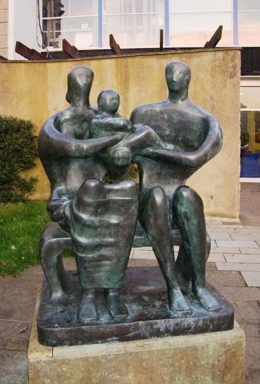
His 1949 piece, "Family Group" is interesting in that context. It speaks to the resilience of human spirit and the strength of families in the wake of the most destructive war in human history.  It too is large and out among the people, but captures as well the strong embrace of the late 1940s family, huddled together against trying times, protecting the future in their arms.

Even the location is an interesting one, installed in Stevenage UK. I've wandered through the edge of this 'NewTown' - a rather dismal concrete post-war creation thrown up to accommodate displaced population. It's rather cold and inhuman in many ways, and the family seems to be pulling together despite the harsh environment.

I find this a poignant statue at our current period in history too. With millions of displace peoples in the middle east. As war and violence illustrate that we learn nothing from the past, there are many people headed north and west, seeking to survive, seeking to draw from their inner strength not unlike that shown here.

There's some strong connection between Henry Moore's art and Canada - and I confess I don't know why that is. But I'm glad we get to see it so often.  The Art Gallery of Ontario in Toronto is home to perhaps the largest collection of his work in the world.


This panorama shows the Moore gallery for your enjoyment.  But it's quite worth a visit if you are in the Toronto area.  Forgive me for letting it blast across the page here, but it's kind of fun seeing this panoramic view.


Monday Morning Art #7a - Pablo Picasso

There are few bigger names in the history of art than Picasso.  Virtually anyone on the street could at very least tell you that he was a painter.  Many likely can identify his genre broadly as 'abstract' and even cubist.  Those works are well known, and recognizable

As I often explore on my Monday Morning Art tweets – you'll note it if you scan back a few posts or follow me on Twitter – the early works of an artist are often surprising and interesting.   Particularly with the most successful abstract painters. My thought is that those who are most adept have a solid grounding classical or at least representational painting.

My reasoning is that if you cannot put a line or a dab of colour precisely where, and exactly how it needs to be to create strong realist works, then how can we be confident that your abstract piece is as you intended it to be?  Plus, who can better break the rules than someone who knows well what the rules are?

Of course, sometimes abstracts are more about happenstance, and an artist will create willy-nilly hoping that something is attractive or interesting in the outcome.  But I have a bit more respect for those who are sharing a vision, an idea, that they fully intended to bring about.

A long intro to say here are some views of Picasso that you may not have seen before.

This piece with a distinct feel of the orient is 'Boy with a Pipe" from 1905.  

It's interesting on a few levels.  The pose and off-centre framing, the bold colour and heavy contours, the prominence of the rose-pattern backdrop or wall, and the flowers around the boy's head.


The influence I most felt in this piece upon first seeing it was that of Gustav Klimt, who was an older, established contemporary, and doing similarly evocative portraits into the 1890s as well.

Take a look at some of Klimt's works, like this piece called Love (1895) or  his "Schubert at the Piano" from 1896.


There's an interesting connection too with this early Picasso self-portrait from nine years before.  The same person? No, I don't think so, but the expression and orientation of the face and figure are similar. There's a confidence and emotion behind both that is interesting.


The sense of an 'explorer of styles' is very evident when you contrast that dark self portrait to one he did a bit later, in 1901which could easily be a Renoir or Gauguin, in classic post-impressionist style.

That orange - my theory was that Renoir was gifted a big case of that orange paint, and used it in everything he did for a while. Perhaps he shipped the left-overs off to Picasso to see what he could do with it


Of course we all know where Picasso goes after this period. The cubist and heavily abstracted work from the '20s to the '60s changed the art landscape in dramatic ways.


Here, is Picasso's "Seated Woman" from 1938.  He continued to create art throughout the 1960s, by then very famous, and considered by some as perhaps even a bit of a caricature of himself.

Then too into the early 1970s he was still active, his later work being seen, after the fact, as the vanguard of a "Neo-Expressionist" movement.