Monday Morning Art #14 - Katsushika Hokusai

I won't profess to be particularly knowledgeable about Japanese art.  There are some broad genres in that milieu which we all recognize, from figurative domestic scenes, to nature scenes, to botanicals, or fish paintings, portraits, or landscapes.

The single most recognizable image from Japanese art, ever is surely the "Wave Off Kanagawa" by our artist of the day, Hokusai from 1831.

There are several notable angles to his life, works, and times that drew me to him for my #MondayMorningArt today.

Hokusai lived a long productive life.  In comparison to the works of the European masters,  or our favourite Canadians, he lived a very prolific life.  He was probably born in October 1760, say the histories. There is some confusion due to conversion of calendar systems and record keeping.  Yet much of his famous work is from the 1830s and 40s - in his 70s and 80s.


I almost hesitate to include the famous "Wave off Kangawa" image because it is so iconic.  Forget calling it most well-known Japanese paintings, it is probably among the top dozen images in art ever, from any culture.


The famous coloured woodcut is part of published series called "Thirty Six Views of Mount Fuji."

It's also one of the most copied, parodied, commercially exploited and reprinted images ever.  From the side of a 1970s van, to packaging of every conceivable food-stuff, it's simplicity, power and dramatic composition are iconic to say the least.

Remember this is in a series - the first in the series - honouring the revered Mount Fuji.  At first glance, the volcano is almost not seen. But with a moment your eye is drawn through the great sweeping, powerful arc of the wave and dropped right on top of the central subject.

The series featured diverse scenes, all enjoyable, in subject, style and tone.  Many focus on the locals of their area going about their daily work. Some are more whimsical in their subject matter.

For example, the 11th of the series is "Mitsui shop in Suruga in Edo" with kites and the figures on the shop roof capture such movement and fun I can't imagine in 1830s European art.

The views of Mt Fuji works were part of a popular movement towards domestic travel that had emerged in the mid 19th century.

Japanese art seems centuries ahead in some ways, with manga/comics and travelogs common and marketed to the masses.  Perhaps it was the Japanese expertise in paper making and wood-cut techniques that set their culture ahead of the west in this regard.

This at the left is "Ejiri in Suruga Province" – number 10 in that series of Mt. Fuji views –
 and again a great one in catching a sense of motion with flying papers, and people holding onto their hats in the strong wind.

But just as striking - look at the representation of Fujisan in this image.  Just the starkest of representations, as a line of its outline.  So far confident, this artist, who finds such freedom in how he chooses to represent even most important element of his composition. The S-curved path, the tree up the left third of the page.  Classic composition devices still taught to young artists today. 

Hokusai apparently went by many different names over his career.  Looking over his body of work, I felt like I was looking at the works of several different artists.  I wondered if historians were mistaken, and had merely lumped together multiple artists of the same period under the Hokusai label.   But a hint to why that may have seemed so is communicated in a preserved account of the artist complaining that one of the block-cutters at the publishing outfit was drifting too far away from the way Hokusai insisted that peoples' heads be drawn.

So it appears that the commercial production of art books had driven them to a division of labour only later to be seen in the west.  With artist and production separated, there are hints of the styles of the intermediaries creeping into the works.

Indeed there were apparently even 'how to' art books produced in this period, as commercially produced and distributed art was so popular. This was an importantt source of income for this master of illustration and publishing.  
Hokusai produced such instructional books, like his "Quick Lessons in Simplified Drawing" to teach other artists some of his techniques, such as in his image of Cranes, rendered in simple lines, in a variety of postures and movements.  It's not quite "draw the kid with the big eyes to get into art school for free" but it's not far off.


Some of the caricatures of people, such as this "Fisherman" in 1835 make me think of American painter Normal Rockwell.  I've never been a fan, but the knobby, somewhat mimicking sytle seems to say something similar about the ordinary folk of the county.


Hokusai does work in all the areas that can earn him commercial success. From portraiture to botanicals. A few "Shunga" or erotic works as well, that could make even a modern Internet browser blush.  His work is widely varied and in many ways I see similarity to works of later century artists like Escher and comic book artists of today.


This lion-riding, sword-wielding, swashbuckler is seems like it would be in good company in a modern comic book.

The colour palette seems like it may well have inspired a much-later-arriving Alphonse Mucha, as featured last week in my MondayMorningArt series.

The golds and reds are certainly right up his alley.  The fantasy nature of the work, as well, would resonate with him.  Hokusai produced many images of cortesans and lavishly painted, kimono-clad ladies too. That would certainly have appealled to Mucha.


Below are a couple of pages of Manga drawings - the cartoons of the time. These Bathers and acrobatic horse-dudes area all about capturing action and movement.


These beautiful carp fish are a pleasure to look at. There are many fish and botanical paintings and woodcuts that define the art of the period, but I have to assume our modern view of such classic Japanese-art subject matter was somewhat defined by the work of Hokusai.


Finally, in the genre of animal subject matter, I enjoyed this little sketch of a tanuki (Japanese raccoon dog thing) curled around a cooking pot.  I assume it may well be a snapshot from Hokusai's real life experience.  I can imagine a cold morning with a still-warm pot hanging over the hearth, and an already black-and-white raccoon enjoying the heat from the big iron pot to warm his bones.


Hokusai dies in Tokyo approaching his 90th birthday.  There's a quote that probably wraps up every biography of the artist, but is a poignant one that probably speaks much to how driven he was as such a prolific artist.

As he lay on his deathbed he is purported to say  "...just another five more years, then I could become a real painter"

Lots of his work has survived to treat our eyes to his view of the world.  And that's even with a bunch of it being wiped out in a studio fire during his lifetime.


He died in Tokyo in 1849. 


Monday Morning Art #13 - Alphonse Mucha

This is a prominent artist from the Art Nouveau period with a healthy dash of 'decorative arts' as well.  Alphonse Mucha is a Czech born in 1860, and well known for his commercial work, and associated pieces which conformed to a rather narrow style. 

This self portrait from 1899 is nice, because it uses many elements of his trademarked style.  The constant use of drapery, the hints of Asian feel in the dress and lines, the glittery gold lighting and muted earth-tone palette.

Mucha lives through a turbulent time, not only in the post-impressionist era of art when the rules were gradually thrown out the proverbial window, but politically as well. Czechoslovakia was not a great place to find oneself as Europe spiraled towards war in the '30s, and that was a pivotal factor at the end of his life.
 
But the optimism and warmth in the Mucha pieces is the key to their success. No wonder product manufacturers and retailers wanted to him to push their products.

Mucha built up his style through a background of theatrical scenery and decorative painting, and a close association with music. He did many posters for performers, and performances. And even as his style and name became widely known in Art Nouveau circles, he was doing posters for exhibitions for which his recognizable style was no doubt a key draw.


His work on product packaging and advertisement posters is very recognizably his.  Here for a hot chocolate product.

Poster work was very important in the emergence of the Art Nouveau style. Perhaps the most recognizable of the Nouveau artists was Henri Toulouse-Lautrec whose poster work is still widely hung on walls around the world.

The necessity for posters to be clearly seen from a distance and to quickly create an atmosphere and positive regard for the associated product or destination means that the compositions were bold, with strong contrasts and simplified subjects.


Here are Much's works for cigarettes, beer and bicycle companies.

The heavy contours Mucha uses around his figures make them 'pop' a bit more among their surroundings.  I would speculate that this style of art is fundamental too in the emergence of the comics of the period after the crest of the Nouveau period - into the 20's and beyond.


The printing technology of the time was likely a contributing factor, in part, due to the limited colour palette achieveable. The result is undeniably attractive.  As in many artistic endeavours, boundaries and restrictions often spawn more creative results.


His use of overlapping to create visual interest is a strong, common element, as is again his copious use of drapery and swirly lines and ribbons and tresses of hair.


The subject matter is invariably elegant and feminine.  If Degas' ballerina work adorns the bedrooms of the youngest girls, Mucha's elegant and more daring women likely took the same place for their older sisters.  Well, maybe not so much the cigarettes and beer posters.


As for many artists with a strong commercial element to their careers, there is an always burning desire to spend more time on purely artistic endeavours.

Mucha spent much effort in later years on a 20 piece history of the Slavic peoples, called the Slav Epic, delivered as a set of large canvasses.   This piece below is the "The Abolition of Serfdom in Russia" painted in 1914.


A large piece, and the depiction is very crisp right to the borders. Even the mist-and-snow enshrouded domes are meticulous.  Here's a detail of the group of subjects from the painting's lower left. Note the drapery, the curling shock of golden wheat, the dramatic poses of figures. Not to mention the bright red scarf - all very much Mucha.


Even the palette is his usual range of earth tones, and gold and red against the pristine white of the snow.

Mucha paints and sketches his daughter many times. How could he resist, his subjects are always women. No doubt she serves as stand in for the figures in many of his pieces.   At right here is a painting of his wife Marushka. Perhaps more of a sketch, though the face is nicely finished. Perhaps a bit more emotion in the picture, given the subject matter.  It's unusual for his pieces to have an unfinished figure like that, particularly when it could have been glorious folds of cloth. But the same muted colours are there.

In the many books and calendars and cards that Mucha portrayed, surely to pay the bills, he rendered personifications of abstract concepts or inanimate objects as women often. This interesting idea of using the personality and setting of his subjects to represent some non-human thing is an appealing one.

He painted the four seasons as women several times. As well as gem-stones, moments in history, countries, figures of religion and myth.

Here is one of his depictions of winter. I like this one because it reminds me immediately of comics to emerge shortly after this period.  In particular I think the works of Hergé, like his beloved Tintin are evocative of Mucha's style.

Hard to fill the scene with his favourite golds and reds when he is depicting winter, but he still manages with the hints of weak sunlight illuminating her dress, and the splash of red among the birds.


And here too is his Autumn. Well, no challenge to illuminate the work in gold when you're doing a scene in the fall. And the red locks of swirling hair come easily too then.


Monday Morning Art #12 - A. J. Casson

By 1926, the increasingly-poorly named Canadian "Group of Seven" artists added Alfred J Casson to the mix.  The Toronto-born Casson, then working as a commercial artist (at the same firm as Frank Carmichael) was invited to show at an event with the other members.  Frank Johnston had left the group a few years earlier, so there was a numeric opportunity at least.

Stylistically, there was also a good affinity, and Casson fit right in.

This landscape sketch captured near Rosseau, in the Muskoka region shows his chops. 

Besides painting the landscapes of Ontario's 'Near North' and further towards Lake Superior, the small Southern Ontario towns and their architecture were one of Casson's favourite subjects.

Some of his views of rural buildings and simple structures reminds me of Edward Hopper. (See my MoMoArt#3 on Hopper)  Certainly the magical lighting effects, and the stylized, simplified details are evocative of Hopper's work. In Casson's work the landscape is always and important element there as well.

This piece is an "Anglican Church at Magnetawan" and besides the brightly illuminating sunshine, there are the sculpted, somewhat ominous trees, a distant treeline and the river in view.


This piece, the Store at Salem also has a Hopper-esque feel to me. While the clouds and rocks and shaded contours are reminiscent of what Lauren Harris was doing too.


Ultimately, the organized Group of Seven artists disbands in 1932 - though Casson as the youngest of the group is still in his prime. He begins the "Canadian Group of Painters" in 1933. But with Harris, Carmichael, Lismer and Jackson on board, it's clearly just a (better-named) reconstitution of the same crew.  (The Canadian Group on Wikipedia. Oh look, Varley, Carr etc too).

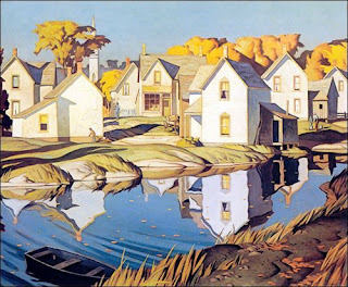
The graphics and screen-printing aesthetic of Casson's background comes through in his work. This one of "The White Village" is a good case in point.

There, the golden trees are towering over the buildings, and the water and rocks in the foreground place the houses squarely in nature.  Figures are rare in his work - all the personality coming from the landscape. 

I shouldn't skew this too much toward the views of small towns, as his trips into the northern bush are a key part of his work.  Casson did many views of Moose lake as well. 

This piece is simply "Moose Lake." 


http://www.artcountrycanada.com/images/casson-ragged-sky-moose-lake.jpgHere is his a more dramatic, less controlled view of the "Ragged
Sky at Moose Lake" as well. It's a bit more wild and lively.


Back in the urban landscape, there are a pair of pictures from around 1927 that stick with me.


These are the rooftops-in-the-snow pictures that capture well the cold, crisp, sunny days in the neighbourhood, familiar to urban Canadians. 


The colour in this image of his "Rooftops of the Ward" might be a little skewed into the orange from the original, but a winter warmth comes through that is very appealing there. 

His "Rooftops" in this second image has a somewhat different style. It's reminiscent of some of the Quebec artists of the time (perhaps Marc-Aurele Fortin).

Alfred Casson played an important part in the development of Canadian art in the Twentieth Century, without doubt.  It's the cross-fertilization of styles from the other artists of the time that is particularly appealing. 

Unlike many of the others at the time, Casson did not have a prolonged European period in his development, as far as I'm aware (though I haven't researched that in any thorough way).  Many other members of the Group of Seven and the Canadian Group had, as part of their education, some time spent painting in France. Some had been born in the UK and had some exposure to the artists of that area.

Casson picked up Impressionist and Nouveau influences once removed from that scene. Perhaps that helped allow him to carve out his own unique melange of those elements.

I'll wrap up with his "General Store" (he found many 'stores general' to serve as subjects).  This one intrigues me somewhat because of the magical background of ghostly blue shapes, reminiscent of Emily Carr's work. 


The piled-up twilight clouds are not unlike Carr's rainforest tree-shapes. Again, structures dropped into a dramatic landscape.  One gets the feeling of these outposts of humanity finding a foothold in the wilderness, but tolerated rather than dominating their environment.  


Monday Morning Art #11 - Tom Thomson

It's a bit cliché for a Canadian to haul out Tom Thomson pictures in their art tribute, but how can we resist? His works capture something of the soul of this country. And (hopefully) most Canadians grow up having seen his work thousands of times. Hopefully most learn his name, or at least remember his work or style.

Interestingly, Thomson only really starts painting seriously after about 1912, when he visited Algonquin park.  But he did apparently learn to paint and draw as a younger person.  There are a few pedestrian portraits of ladies in suitably Victorian garb.  I found this ink sketch from 1905 of a Young Fisherman to be one of his early good pieces.  And it hints at his future obsession - landscape, fishing and the interaction of people with nature.


Probably the most iconic of Thomson's works is Northern River (1915).  The vertical lines, the silhouetted spruce trees. and the glow beyond over the river epitomizes the Thomson view of the mysterious landscape.

For me it puts me squarely into a spot I knew as a kid growing up in the northern landscape. A favourite path off into the bush, where the next city in that direction was probably Moscow over the other side of the North Pole.

The tangle of the brush and red leaves underfoot could only be captured by someone who had been there.


His piece "The Pool" from the same year catches that moment when everything is red and orange, just before it has all turned to black and white.


 There's a chill in that water that is palpable. You'd feel it splashed on your hands as you pushed your canoe into the little lake to pick up your route on the other side.

It's election day here in Canada, as I pulled together this Monday Morning Art spewing of pictures on Twitter, and it makes me think of what the Thomson legacy says to us. I keep coming across symbolism and ideas I might not have thought up had it not been election day.  I offered Thomson's "Twisted Maple" as a bit of a kick-off for the my Monday art stream.


Again, it's an autumn scene.  Thomson liked to capture this time of year. Sure he has other works, like A Summer Day which depicts the big blue skies and fluffy clouds of another season. But often he'd use the colour of his Masonite panel in the work to provide the hue for the reddish purple leaves in his composition.  Autumn gave him lots of opportunity to do that.

Much of Thomson's sketch work (and the 'Group of Seven with which he is closely associated) used small plywood or Masonite panels of about 27 by 21cm, on which he would paint an image on both sides. 

It creates a challenge for galleries hanging his work. Some rotate the panels every few days or weeks. Others display them in two-sided glass cabinets so we can see both pictures.


 The sketchy quality of the pieces adds to their appeal. In the quick capture there is an immediacy and an immersion into the landscape that you might not get from another artists more larger, more polished piece. 

Much of the landscape Thomson and the group of Seven painted was often burned over by fires that would sweep across the boreal forest unchecked. Occasionally there work was in cut-over lands as well. 

These somewhat denuded landscapes expose the rocky Canadian shield, like the bone structure of the region.  Like the meandering rocky sections of the shield, the burns also afforded the artists vistas that would otherwise have been obscured by trees.

It's the visceral 'like-being-there' sense of the bush that captured most in the Thomson paintings.  And for those of us living in that environment, or growing up with it, it is always "the bush" and never the forest or the wilderness.  Those terms were always giveaways that you were from down south, in a city somewhere.

The authenticity captured in Thomson's work shows him to be 'of the land' in that it connected with him, and he knew how to live in it. I suspect if I ran across Thomson in a canoe on some northern lake and talked around a cooking fire on an exposed chunk of granite, he'd only use the term 'bush' too.

This view of the birches in "Early Spring" (1917) was in the spring of his last year. Sadly he was found dead in July of 1917, in Canoe Lake.  And while it was ruled an accidental drowning, there were also hints of murder or suicide. There is much written on the topic, and so I'll leave that to the many theorists.  I think though that it is unlikely Thomson would have willingly left this world. With the prolific and inspired work of his last five years, it's unlikely that he would have seen his work as anywhere near finished yet. 

I regret that there are many would-be paintings that we never got to see.


Monday Morning Art #10 - Maurits C. Escher

Born at the end of one of the most dramatic centuries in art history, Maurits (aka Mauk) Escher was a contemporary of Salvador Dali and René Magritte, and there are certainly some similarities to those artists in some of his early works. No doubt they were cross-influenced at numerous stages in their careers.

Escher has difficulty in academics and focuses on illustration. In the beginning his work with centres around portraits, figures and landscapes. And a few cats.  But his chosen media drives his style and fosters a later interest in patterns and line that is quite profound. The stark blacks and whites lead him to an early exploration of shapes. 

This early piece is called "Twon Tree" (1919) takes a simple landscape, but departs from realism and turns tree branches into a swirling, surrealist pattern that explores the geometric. 


But for another two and a half decades, Escher's work is well grounded in reality.  His landscapes and buildings are sharpy captured, with strong lighting and perspective.


He does a number of works around Italy, from the Amalfi coast, to rural mountain villages in Tuscany.  The stark lights-and-darks of the tower faces in "San Gimignano" (1923), capture the village just south of Florence, are are captivating with their drama 


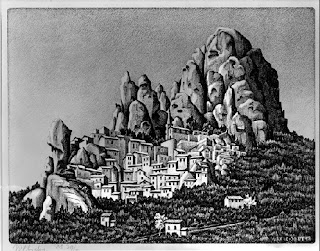
This untitled village (1930) nestled in the mountains is a striking asymmetric composition.

There is an underlying hint of magical realism gained from unusual angles and somewhat organic, amorphous shapes.

A pivotal piece for me is this one called "The Bridge" from 1930. Presumably this is on the Amalfi coast, where he was painting many scenes at the time.  The combination of three things appears to be important:
  • The unusual angle
  • the complexity of the blocks of houses, and 
  • the geometry of the staired-bridge, and the adjacent stairs on the buildings. 


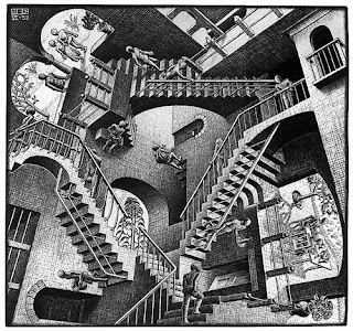
This surely leads him towards some of his best-known works of impossible staircases,  like the House of Stairs in 1951 and the famous "Relativity Lattice" (1953), shown here.


 Across his career, Escher also likes to explore the impact of unusual optical effects on an image. He does several self portraits based on looking at himself in a spherical lens.  Here is a rough montage of five of those portraits.  Beginning in the top left, the years of creation are: 1921, 1934, 1935, 1946 and 1950. 


By the time we're into the late 1940s and '50s, Escher's work is almost completely exploration of geometric patterns, eye-twisting illusions and fascinating negative/positive space interconnections. Flying FishLizards or Butterflies for example - all fitting together perfectly in a pattern. 

To wrap up, I thought this very Internet-friendly image of a cat, from Escher's early years (1919) captures a bit of his earliest thinking about negative and positive space.  This appears to be a woodcut, leaving the artist the challenge of representing fuzzy fur with only lines. The result is very successful indeed.


Monday Morning Art #9 - Edgar Degas

Perhaps one of the top three or four names of the Impressionist and Post-Impressionist movement, Edgar Degas is one of those instantly recognizable artists.   His dancers, situated in obliquely viewed rooms, or on the stage, with upward-projected footlight illumination are iconic.

Perhaps most use of those images today are to adorn a young girl's bedroom wall.  Some sort of epitome of femininity or girlishness, but Degas is also known for capturing the gritty, challenging life of the stage performer and dancer. From his many back-stage semi-nudes, to the sad faces of down-and-out people; the less beautiful part of the Belle Époque.

The Degas that sticks with me, partly because of the subject, but also because of the composition, is one that was seen as a shocking departure from the conventions of the time. This is "The Glass of Absinthe" or "The Absinthe Drinker."

The diagonal lines of the tables bring the eye up from the bottom to the solemn figure of the lady with her glass of absinthe in front of her. A carafe of water sits to her right.  Her companion pays her no attention, and she stares blankly down at the table or perhaps the floor in front. You can feel the weight of her woes.

But this is a well-known work of Degas, and I like to explore the less recognizable pieces in my Monday Morning Art tweets. Thus I sifted through his early portraits for a few lesser-known gems.

His early work featured a lot of portraiture and sketch work, which gave him a strong foundation for his future with the figure, and ability for capturing scenes that were often fleeting in their nature.

Indeed, I think his strength is the snap-shot capturing of expression, and giving us a window to the soul of people who, to outsiders, would have seemed glamorous. We're brought into the theatre back areas, to see the sad realities, and hard lives of both the beautiful and worn-out people of powder and stage.

This portrait of "Estelle Musson Balfour" from 1865 for me captures a moment so sharply, it's hard to imagine how he did it without a modern camera.  But this is the era of the Dageurrotype, and minute-long exposures.  There's another Degas you can find online, an image of a young lady piano player, presumably at a ballet class or a practice, who turns and looks at Degas (and us) for a brief moment that is similarly captured in brilliant sharpness.   The Estelle picture, though, seems to speak of distress and sadness, and we're left to figure out what it's all about.

A later portrait, this of "Emma Dobigny" was done four years after, in 1869 and similarly captures a moment, if a less fleeting one.  Emma stares somewhat vacantly into space, presumably lost in thought.  She could be a teenager on a city bus today. Looking at this image, you expect to see her break from her reverie momentarily and look at us if we were to speak her name, so we stay quiet just a little longer.


Further to my treatise about Degas' foundations in portraiture, and sketching, is this portrait entitled simply "Portrait of an Italian" from 1856.  It is a charcoal crafted with a deft touch.  The subject's hair catches the light, and facial expression is perhaps a moment between two words, frozen in time.

I've speculated that this is actually a modern sketch of John Turturro, but I can't prove it.
 
Of course, Degas is broadly known for his dancers, and why not?  The images are very popular even to this day.  His compositions, I've mentioned elsewhere, are surely a strong influence on later artists like the American Edward Hopper.  The diagonal elements and unusual lighting particularly seemed to resonate with him.

So, here are a couple of the well-recognized dancer scenes to close.

Take a moment to see his less well known 1881 sculpture of a fourteen year old dancer too.  It's quite exquisite.  Not sure why he didn't do more sculpting. Maybe Rodin frightened him off.

The "Dancers Practicing at the Barre" (1877) illustrates a popular theme with Degas, and there are many scenes of similar structure.  He was, no doubt,  enthused with the strong diagonal line around which the figures interact. A delight for a painter who likes to compose his pictures that way.


"The Ballet Class" is one of a few similar scenes one might think were photographs snapped one after another in a five minute session.  The aging instructor leaning on his staff features prominently, and the dancers both watch and execute, according to his direction, various moves.

Degas brings us up onto the stage, where the footlights are bright and the humanity of the performers is close at hand, then he brings us into the back-stage areas where they dress and get ready, or disrobe or caress their aching limbs and fight their knotted hair.


Monday Morning Art # 8 - Marcel Duchamp

My ongoing Twitter event occurs every Monday morning, which is rather obvious since it's called #MondayMorningArt.  This week I chose another important artist from the early-mid 20th century, Marcel Duchamp.


He is ultimately most known for conceptual and even 'Dadaist' art later on, but as per most of these Monday Morning Art explorations, it's always interesting to see where our artiste du jour started their journey.

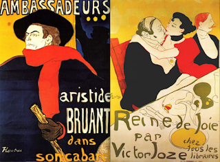
This piece is "Yvonne (in kimono)" (1901) and for me connected well with the poster-art of the Art Nouveau movement well underway by then.  The dominant player in that space is of course Henri Toulouse-Lautrec, and there are certainly influences from him.


Here are two pieces by Toulouse-Lautrec with which Duchamp's work seems to share some common ground.  (Those are two posters side-by-side, by the way. Sorry if they are a bit munged together - not intending to suggest they are one piece.)


Those two are from a decade or so earlier. Indeed, Toulouse-Lautrec died in 1901, the year Duchamp created the "Yvonne" piece. Lautrec's style and approach would have been well known to his countryman Duchamp.

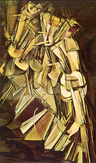
From his initial poster-like, classical portraiture and figures, Duchamp gets quickly into the abstract and cubist.  His signature cubist piece for me is "Nude Descending Staircase" (1912) which has stuck with me since first seeing it in high school art classes. (My teacher was a guy named "Mr. Arts" believe it or not).


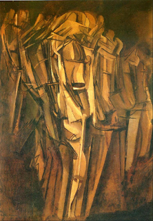
Duchamp explores a number of these geometrical compositions. They are seemingly time-lapse interpretations of a figure in motion. One can only speculate that he must have visualized creating these pieces whilst watching people pass about him as he himself travelled about France.


Here's another piece, "Sad Young Man in a Train" from 1911.  Though the form is almost totally hidden, you can still see him and sense his motion, and it doesn't take too much imagination to see the down-turned head of the sad young man.  Maybe just a modern context here, but it looks to me like he has a ballcap on, and hands in his pockets as he steps off the metro.


Duchamp is a notable and early force in the installation art movement. So I will also share two pieces I've had the pleasure to see in person and enjoyed.


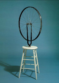
The aptly named "Bicycle Wheel" (1913) I remember vividly seeing, but can't recall where. The credit on the picture at WikiArt says it's in a gallery in Israel where I have never been.  Some day I'll figure that one out. Tweet to me if you've seen it too, and remember where.  I'm thinking Toronto, Montreal or NYC perhaps.

Anyway, Duchamp likened the piece to a fireplace, and says he lived with it in his studio for a long time, where he would spin it and watch it, "like a fireplace."


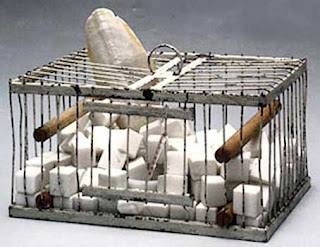
This last piece, I do remember seeing in London at the Tate gallery.  It has an unusual name that spawns a number of stories itself, let alone those from the object.  It's called, "Why not Sneeze, Rose Sélavy" and was completed in 1921.  Interestingly it has a signature of the artist dated 1964 on it as well.  I'm sure there's a story behind that, which I don't know.

I had to look it up - and it turns out that Rose  Sélavy is Duchamp's alter-ego.  He was known to dress as a woman sometimes and used that name.  A little more understood in today's world than it likely was back then.   Perhaps easier as an artist, known for his avant-garde approach to the world, but a challenging time no doubt.

This piece contains cubes of marble that look very much like sugar cubes (I thought they were) and a thermometer and part of a sea creature.  It speaks of temperatures cold and hot apparently, and something about the things we lock inside, and those that stick out through the confining bars.

I think Rose could relate.