Nobody Blogs Anymore

Is a post every eight years still considered blogging? 

Blogging still works for some people.  It's got some utility to a business/marketing presence to gather search-engine hits and to show that a business is actively working in the space of interest where its customers live.  For individuals though, while I know of a few people who blog their daily lives occasionally, I know of very few people who follow a blog regularly. 

As a supplement to another, more immediate or more engaging presence, I can see a blog making sense.  People see your YouTube du jour and want to know more about what you're up to, so visit your blog and read a few posts.   Or the way I was using it, rather than post a big thread to Twitter, I'd expound more verbosely on here.  It also serves as a handy way to share some links to other information beyond the short quip one might post to a social media site. 

 I've long since ditched Twitter in favour of Mastodon which I find very nice and much more engaging than the ol' Bird Site.  As mentioned eight years have ticked by without having an urge to share something on here. 

When I was changing up my Twitter avatar with a different designer chair every few months, the blog was a great spot to share not only details of the latest chair, but archive the earlier ones.  That was a lot of fun. 

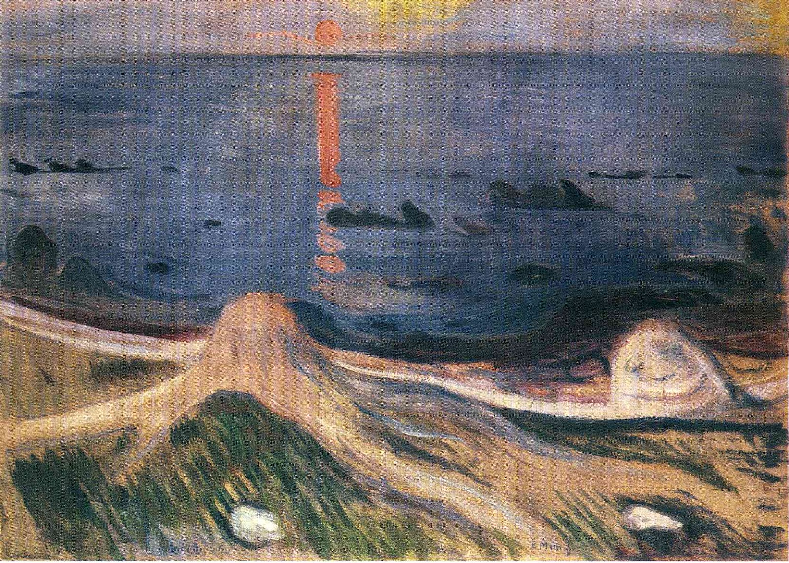
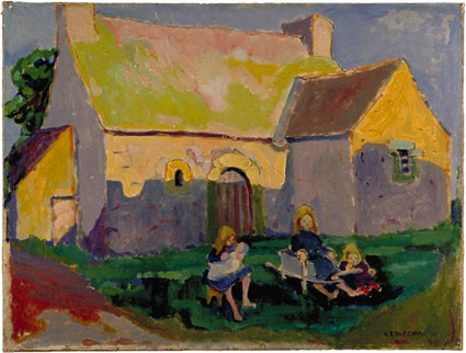
When I ran a weekly series of Twitter posts on fine-art works that I love, and my thoughts about them, this blogging platform was great for the wordy-version of the posts.  That had a small but appreciative following, and I enjoyed that a lot, though it was quite a bit of effort for a Monday morning. 

Anyway - you might see an occasional flurry of activity here… or perhaps I'll be back in 2033 for a brief update.

Blog Clean Up

I don't blog a lot, and mostly this blog is a supplement to my Twitter presence. But it is sometimes useful for sharing more verbose thoughts on a topic of fleeting interest, or for following up a Twitter conversation with more details or other information when somebody expresses an interest in a tweeted topic (often a recipe of some sort or another).

Today I've done a bit of housekeeping on the site. Mostly I've added some tabs at the top of the blog gathering together some topics which might otherwise never get seen again, until some random googler hits them. What would that be, perhaps once or twice per month?

So if you have interest in food-related chatter, my art series (which delved into the lives of twenty-one great artists of the past century and a half) or if you want to read some longer posts on rather pointless topics of my particular (& peculiar) interests, give the tab items above a click.

Meanwhile, this blog will continue forward with a minor post or three per year.

Ciao, from spring 2017.

Too Many Words™ on "Trust In Me"

In the series of Too Many Words™ posts this article explores a favourite jazz song.  For other long reads on truly random topics, see the TooManyWords page.

I love the old jazz standard "Trust in Me" which has been a favourite of Jazz vocalists for the better part of a century.  [Not to be confused with a more recent song of the same name that was used in the JungleBook Movie].  The jazz classic song dates all the way back to 1937, when penned by songwriters Ned Wever, Milton Ager, and Jean Schwartz but is probably best known as a 1960s hit for Etta James.

The first version I knew was the 1963 Dinah Washington one.  It was on a compilation I acquired early in my burgeoning enthusiasm for Bebop jazz and grew on me as I came across other versions.

Washington's version is great for her trademark vocals. Though not as power-centric when compared against the energy of probably more-famous Etta James version, her more plaintive and understated style works well with the song's lyrical content.  Where James evokes an almost hair-pulling frustration with her partner, Washington's is more of a late-night, heartfelt plea after a few drinks.

The recording is a bit strange, though. There's that little touch of misplaced reverb in the second stanza and orchestral accompaniment swells into a bit more of a 1940s feel than 1963 when it was recorded. But the brief trumpet piece before the bridge is pretty sweet, and worth the price admission.

Most notably, though, the ending of Washington's version is much more satisfying than is the Etta James arrangement, but more on that below the break.  Have a listen:


The popular Etta James version of 1960 really nails it for raw emotion, and was suitably popular because of it.  A modern listener can't help but think this is a little of the spirit that infected the latter-day, though already late, Amy Winehouse.

James starts the song soft, with almost a bit of a shy and raspy Billie Holiday feel.  The recording is richer, warmer and more spacious.

Etta James gives us a plaintive lead-in but her tone quickly changes to punch the crap out of it.  The band's horns don't really get involved until two thirds of the way through the song, but we're ready for them as James's pipes hit some notes worthy of a gritty trumpet solo.

The back-and-forth of her lows and highs takes us through a roller coaster of pleading, anger, lofty aspiration, and playfulness.  It's that range that really sells it.  Here's some playback from YouTube:


When you hear the power of her bridge, you think she has topped out, but she amps it up again in the last verse, going into the wrap up.  But the arrangement ultimately disappoints in the wrap us, as all that power takes us nowhere.  They opt for a rapid fade-out on her final pleas, rather than bring us to any sort of a conclusion, as Washington did so much more effectively.

I don't know the details of why there were two strong versions of the same song so close together – Washington's debuting three years after the James hit. Perhaps battling record companies? Washington's version was on Mercury vs. James released on the Argo label.

The song has some serious roots though.  When we hear a remake of a song these days, we may think of it as a more modern thing – the recycling an old hit to try and cash in with a new generation. Of course that's a well oiled machination of the recording industry.  And who can begrudge an artist inspired by a classic song, as long as they can do something new with it.

The original song came from the New York songwriting team Wever, Ager, Schwartz. They joined up from disparate backgrounds, originating from their respective New York, Chicago and Budapest origins.

The song hit for them in 1937 with a singer sporting that oh-so-marketable name Mildred Bailey.  Have a listen to how it originally sounded:


The arrangement Bailey sings follows a more classic structure, beginning with a lead-in verse that gets dropped in later hit recordings.  It evoked for me the feel of Hoagy Carmichael's infectious "Buttermilk Sky" (or the other way around, as his song is ten years later). The music is gentle, understated, and horn-centric, with an early jazz/ragtime feel. Both the trumpet and sax performances  shine.

That opening verse provides some back story for her approach to her untrusting partner. It evokes more of a sense of a couple braving the wilds while homesteading in a frontier town.  The edgier 1960s versions speak more of smokey jazz club infidelities and night life.

But the history of this song is broader than this in both directions. There was a strangely accented, mid-forties version by 'Hadda Brooks'  (hear it on 78rpm record). While the vocal is strange, the music is very good. And it's the first recording I know of that drops that intro verse.

Two men recorded versions too - both Eddie Fisher and Louis Jordan recorded in a previous round in 1951.  The Eddie Fisher version is really terrible. It features over-the-top choral background vocals more suited to a Walt Disney animation soundtrack. and a monotonously emotionless delivery by Fisher.

I haven't heard Louis Jordan's version - but his big-band really swings, so it would be interesting to see what he did with it. 

Our modern celebrated Beyoncé did a version for a movie about a record industry.  It didn't work out so well.

I'll let you decide for yourself, but she tries way too hard, rendering her attempt thin and forgettable.
She opens okay with a soft delivery, but quickly goes off the rails. She's not helped by the pathetic orchestration.  The bad sounds just one step up from a shopping-mall Casio 'orchestra in a keyboard' system.


After the first stanza, she seems to think listeners will lose interest if she doesn't add some gimmick or flourish to every other word.  It's at its worst nearing the end, where every second word seems to need a growl.

"Have they noticed my growl? I can do more. How's this?"  It's like she noticed that brief note in Etta James's voice, and tries desperately to find it herself.  More is less, and there's much less there.

And the ending of this arrangement is even worse that the decision to fade out Etta James. The low energy back-up music does a fade out, but Beyoncé's lyrics just stop as if she dropped her sheet music rather than with any sort of intentional wrap up.  No finesse there.

But you don't listen to Beyoncé for her classic jazz attempts. Here, have a little Lemonade.   

Lots of other lesser known modern singers have had a shot at singing "Trust in Me."  It's not unusual to hear it at your local jazz club.  I'm sure there will be another big-name attempt when someone comes up with a new take on the classic piece.

Browse YouTube for some other treatments. For example there is this longer rendition with expanded verses which you won't usually hear outside a live club setting. This is an east coast American club singer name Shirleta Settles on there – worth a listen, in spite of the cheezy lounge chatter she throws in for her audience.

The theme is thoroughly recognizable, so it'll often get an instrumental treatment by a jazz trio here and there. This version from Thelonious Monk and Clark Terry isn't too bad a listen.

Ultimately, it'll be hard to out-do the Washington and James treatments. But I'm always game to hear another take on it.  Given that the song emerged in the 1930s, I'm not sure many modern songs will ever be able to claim such longevity.


Zuppa della Something-or-Other

This is a very economical, yet filling dish that really appeals to me on cold autumn or winter nights. Easy to make it vegetarian too, though vegan might be a bit tougher, as it depends on a cheese that melts well.

Back story is that we were watching a documentary on the rural peoples of the Italian Alps, and someone in a small mountain village went through this in enough detail that I could reconstruct it later.  Only problem was that I didn't remember the name, so we call it Zuppa Della Something-or-other.

We got some large & tasty, last-of-the-season cabbages at the farmer's market in a snow-storm for a dollar each, so the per-serving cost was pretty low.  Fontina cheese is about $10 for a good sized chunk - so that's the main expense.

Ingredients
 Cabbage (red or green) - about 1/3 to 1/2 of the head. Remove the core and slice
 About a cup of cubed cheese. Authentic is using Fontina.  Gouda works in a pinch.
 About 2 cups of chicken broth (substitute veggy broth if so inclined)
 Half of a French Bread stick/ baguette. Dried a bit is best. Cubed.
 1/4 cup of butter
 One onion - chopped
 Two cloves of garlic - minced
 Olive oil
 Favourite Italianesque herbs (e.g. thyme, oregano etc).

Method & Notes
Cover the cabbage with water in a large pan and boil for a while until it's softened (about 15-20min).
Meanwhile, fry up the onion and garlic in olive oil, with the herbs thrown in too. Just cook until they are turning 'transparent'.
Get a large saucepan - I use the same one I boiled the cabbage in. Just drain the cabbage and then build up layers in the pot.  Start with a layer of cabbage, use half the cheese and bread cubes, with half the onion/garlic mixture. Add another layer of cabbage. Then the rest of the bread, cheese and onion stuff. Then finish with the rest  of the cabbage over top.
NEXT - you pour the chicken stock over the whole mixture.
THIS is a bit of an unusual point.  Even though it's a 'soup' the goal isn't really to have a bunch of broth.  If you peek down to the bottom of the pan there should be some broth there, but you aren't trying to fill it up.  Adjust your broth amount accordingly.
FINALLY - take your butter in a small sauce pan and boil it up until it's frothy and you're getting some brown solids in it.   Take that and drizzle it over the whole mixture in the pan.

Now heat it up until the layer of broth boils a bit, then let it simmer for 20minutes or so.  Give it a stir or two during the process.

Serve in bowls.  It goes well with toast too.

Be prepared - you'll want seconds.

Serves about 4 people pretty well. Sticks to ribs.

Making Sourdough Bread

Those who have the misfortune to have me in their Twitter stream know that I am prone to making bread rather often.

 I enjoy making all of the bread we use in our house.  Mostly this is because I enjoy the craft of bread-making, and have for most of my adult years.

But there are ancillary benefits. I like knowing exactly what is in the stuff we are eating and controlling the levels of salt, fat and sugar. As well, reducing preservatives and additives which are great for shelf-life, but perhaps not so great for consumption is a benefit.

It is a very tactile and creative activity.  I like to share what I can with those who are learning,  trade stories with other experienced devotees, and learn from anyone who has ever made some good (or bad) bread.

When it comes to sharing the task is made more difficult as I haven't used recipes for bread making in a very long time.   I know it sounds like I've been memorizing recipes and measurements, but in reality it is a more simple process than that.  Once you learn the textures of the various stages, and learn to pay attention to the hydration level (ratio of flour to liquid) there isn't much complexity left. it's more technique and 'feel.'

The result is that you can use as many or as few ingredients as you wish.  I've often made bread with simply flour, sourdough starter, and water.  Though that's usually just me forgetting to add a bit of salt, which enhances the flavour a lot.

I like to share my sourdough starter around a bit within the community.  I try to do so as much as logistics allow.  This means I get to share the fun, but also, it gives me a path to replace my old friend if I accidentally kill it sometime through neglect or mishap. Sharing the enjoyment is my key goal, which is a fun thing unto itself.

I have a detailed sourdough primer (PDF) (updated 05/2020) I've been tweaking off and on a few years, so I'm happy to share that with anyone who wants to make their own and avoid some of more prescriptive online sources that dictate rigid schedules and regular divide and discard approaches.  It's really not that hard, nor need it be wasteful.  Hoping you can give it a try sometime.


Too Many Words™ on Twitter and Its Evolution


Twitter leadership had a challenging job to effectively monetize the popular service.

The emergence and initial success of Twitter was a bit of a lottery win in the first place.  Throwing something together at the right moment in history was fortuitous.  But the skills to sustain it and preserve its value did not come with the big novelty cheque.

They did a lot of things right: let the service catch on, and gradually build the advertising platform around it.  The revenues continue to grow, and the advertising options appear to appeal to many.

Indeed, the level of advertising is beginning to be a bit intrusive at times, but it's generating substantial revenues, which should ensure the service remains around for a while.  And there have been exorbitant rewards for the founders which seems appropriate as well, given that they were the ones who won that lottery. They got an application out at the right moment in history when users were ready for it, and sustained the plumbing to the point of critical mass. That's worth some reward.

But as we see Twitter leadership making, or suggesting, fundamentally bad directions forward, one gets the idea that they don't really understand the animal they've been training.

The cadre of designers and business enthusiasts that ended up with ownership of this popular microblogging site are possibly not the right ones to carry it forward.  With a slightly different landscape,  would a different team, with better long-term ideas have put together a similar short-message micro-blogging service a few months later to find themselves with the winning ticket?  Likely. But regardless of who lays a house's foundation, they don't necessarily bring the skills necessary to make the village thrive.

Capabilities emerge based on the technologies that are available. Intuitively, certain elements get combined to produce applications.  Low-cost, easy-access networking, plus an easy-to-use input means results in humans sharing things with each other.  That was a natural progression out of Usenet and bulletin board roots. Blogging and short-post sharing became big and popular not because someone 'invented' Blogger, Wordpress, Tumblr or even MySpace, Friendster or another on-ramp, but because many of us were already doing similar things the hard way, or on a precursor platform.  Gradually developers craft tools to increment the process, and make it easier. Those steps are more often about first-to-market, or occasionally best-to-market.  Sadly, often good-enough is a stand-in for "best."

In the climate of fast moving tech, any ten small teams of people "skilled in the art" (as patent lawyers say) of posting text to websites would find it obvious how to make the process easier.   You quickly end up with ten different-but-similar approaches. Given the right environment, all of them are basically functional and achieve the goal of users being able to do their thing.  The offerings remaining after a few months are determined by factors such as ease-of-use, responsiveness, and depth-of-pockets to cover the hosting/operational costs to keep the service up.

Forming another ten such teams a month later would produce other workable, and not all that different services (beyond cosmetic colours and button placement).  Indeed, in most cases there is no secret sauce, no mind-bending invention of clever design, no eureka moment of unique insight required to deliver the effective solution.

With Twitter this was the case.  Given the existence, and heavy use of blogging, and thousands of service offerings coming and going,  every variant of such a service gets explored. Every approach to inputting content and sharing it.

Input by SMS was the only mobile game in town, and a reasonable, useful and obvious approach. Indeed at that point in time, SMS was a popular, emerging on-ramp for many services. The yet-to-be-ubiquitous broadband service for mobile HTTP-based interfaces didn't exist yet.

The 140 character limit turned out to not only be 'good-enough' the experience of crafting concise messages inspired creativity and allowed certain talents to shine.  It's a well known value among creative people, that spaces with difficult boundaries are often inspire more than blank, wide-open ones.

It was most certainly not design-intent in the creation of Twitter, but rather a side-effect of the available technology, with a very positive result.  Illustrating that Twitter was not formed from a cauldron of deep, innovative genius has been the on-going handling of the product.

Don't get me wrong - there are clearly smart people doing innovative things in keeping the service up and responsive. Hard things too.  Managing the infrastructure, implementing the interfaces to the specs handed to them by the feature design people. These are hard, time-consuming jobs. These are good and valuable skills and talents, and are key to any functioning Internet-based business. And when is the last time you saw the Twitter FailWhale? There is a robust service there.

But services have requirements beyond keeping everything functioning. While on-going spotty service can erode a business, getting the direction of the ship wrong can sink it just as easily.   

At the conceptual level, some services can have a tendency to not understand the user.  And here there seems to be constant blindness to the nuanced differences between Twitter and Facebook.  Perhaps it's the pressures of a now-public company to fall into traps like looking purely at user numbers.

Those of us participating from the early days saw Facebook scurry about trying to force its rigid, closed structure into a more Twitter-like approach.  Twitter's public timelines were fundamental to a rapid uptake of and broad integration into traditional media and broadly into the customer support business. Facebook had to work hard to try to enable some part of that attention, and still lags behind in that engagement.

Twitter is continually painting themselves into a "quantity not quality" corner when they get distracted by comparing their user-numbers with other social media platforms.

The fact is, that Twitter with boundaries self-sorts.  Not everyone is capable of conveying meaningful information in 140 characters. Those able to say something concise, engaging and/or entertaining within the boundaries garner followers.  Those who cannot may not get a broad following, but can still find value within a smaller peer group, and as a consumer - rather than generator - of content.  They must focus on engaging the right kind of users, not just broad user numbers.

And some users (Twitter leadership doesn't get this) may not find value, interest or an outlet in the social-media variant that is Twitter.  That's okay.  Not everyone read the newspaper (when that was a thing).  Many people don't watch TV news, nor listen to radio news, nor write letters to their cousin, nor blog.  The service need not be all things to all people. And diluting or pandering to every perceived whim of any user does the service no favours.

Now rumours from the leadership brain trust suggest the destruction of the 140 character limit. Throwing open the doors to 10,000 chars, or no limits at all, has savvy Twitter users worried.

Savvy users understand the fundamental "less is more" nature of the service, and worry about its potential demise.

We've seen a long-standing concern regarding erosion of the chronological timeline as well.  And still many wait for responsible changes, like dealing with harassment and hate tweets are not effectively implemented.   And some well-needed simple elements like a short editing window (two minutes?) to fix typos are in high demand. (Some suggest allowing a small number of characters to be changed would provide the same value.)

Many are the epic tweets ruined by a small typo.  Deep is the shame of content creator whose thoughtful and timely tweet - with potential for much sharing - is ruined by an autospell substitution error.

Can we see thoughtful changes that invest in enhancing the quality of Twitter rather than pandering towards a Facebook-like populist, lowest common denominator?   That will take some leadership and understanding behind the platform's leadership.

It's not clear that the leaders who fortuitously found themselves with this platform are savvy users who understand what they have.

Article's Character count: 8372


Monday Morning Art Completes

Thanks for following the Monday Morning Art posts here, and the Twitter tweets with the associated hashtag.

With the end of the 2015 calendar year, and 20 posts under my belt, I'll stop here for now.  It's been fun digging into the details of a bunch of artists, some well-known, others not so much.  It has also been fun to expound on their works, influences and their evolution as artists over their lifetimes.

Alfred J Casson "White Village" (1938)

My analyses carry no weight beyond that of just-another-observer.  If you disagreed with me or found a comment annoying - that's great.  (This one really pissed people off for a while here in Ottawa.) 

That is what art is for - invoking opinions and debate about ideas, images, and perspectives. Warm thoughts and happy sighs are just part of the opinion/experience spectrum.  I hope there was a little bit of all-of-the-above here for you.

Jackson Pollack's "Lucifer" (1947)

If a comment or two helped someone look at a piece a little bit differently, or introduced someone to a work or artist they didn't know before, that is reward enough.


Maurits Cornelis Escher's Cat (1919)

Monday Morning Art #20: Edvard Munch

This week's Monday Morning Art extravaganza comes by request.  As the artist behind one of the most recognizable paintings of the past 150years, Edvard Munch was certainly on the radar for future attention, but with the request of Melissa (aka @eastcoastknits) I've bumped him up to debut on this pre-Xmas twitter-art episode today.

Before he produced his pivotal piece(s) in the final decade of the 19th century, Munch plied his craft through the usual processes of realism that matures into more personalized expression.  There are often interesting hints of what is to come in such early works.

The Norwegian artist explored his style under the influence of his contemporaries or course, and later some influential time in Paris. At times his pieces drift into echoes of Renoir (Sick Child), Pissaro (River at St. Cloud) or Manet.

This early (1883) portrait of a young woman kindling a fire is a nice piece that could as easily be an Andrew Wyeth from 80 years later.  He captures the figure lovingly and freezes the moment very well, with the hint of orange warmth radiating out from the growing fire in the stove.


There is an on-going interest in the bold diagonal element to his compositions, sometimes evocative of Degas.  Indeed his portrait of Writer Hans Jaeger is quite evocative of the famous "Glass of Absinthe."  A look over many of Munch's works show the dominant diagonal to guide the viewer's eye.


But soon Munch layers his representational semi-impressionist compositions with a surrealist edge and a despair that creates a deeper level of interest.


His self portrait as a young man of 22 in 1886 reveals a more visceral quality.  The contrasts and the expression captured are of a combined defiance and ambition.


In the 1890s Munch is in his prime as an artist, producing many notable pieces.  Sure, a few sunsets - this one appearing very much like a Monet sketch, but other pieces hint at troubled times.


He approaches the pivotal year of 1893 when is likely troubled by mental illness difficulties and will reflect that in a few pivotal pieces.

The bridge over a fjord serves as a backdrop for many Munch pieces. One must consider the symbolism in the bridge - perhaps stretching between normality and despair, positive and negative, humanity and nature.

His painting "Despair" touches on what is to come the next year.  It likely depicts the same incident he describes later as the situation of his 'Scream" work. He says he was unspeakably tired under a red sky, stopping on the bridge over the fjord. In a feeling of desperation, and as his friends continued to walk on he saw the vibrant sunset and the blue waters, and felt that nature itself was screaming out to him.


In 1893 he creates his first version of "The Scream" in a pastel drawing.

He recreates the piece in 1895 as a pastel again, and then in various other media over the coming years.   The 1893 version is shown here.   The '95 was sold recently for almost $120M.  The rest of the versions remain in Norwegian museums where they are apparently periodically stolen, with minor damage.

While Munch later describes himself as "quite mad" for several years after this period, he still manages to produce interesting pieces.  This landscape of is from 1899 and is very evocative of a Monet sunset.

He has some exhibit success and positive regard from his shows.  He lives in Paris in the late 1890s - how could that not but have a positive affect on an artist? What a time to be alive, and what a place to be.  He returns to Norway, and travels to Italy, and has a somewhat stable relationship. Spoiler alert - it doesn't last, ends badly, with rivalries, gunshots and and injured fingers, apparently, in the process.

But still some interesting work. Isn't it always the way with troubled artists.  His portrait of a Fisherman in 1902 is an interesting work. The colours and light are quite engaging.

He had both popular and financial success with pieces depicting a sick child as well.


I also enjoyed this landscape from 1903 of "The Forest" where he seems to feel something akin to what Emily Carr puts into her work in the decade that follows.


Following this are even more troubled years for the artist, with heavy drinking and brawling a part of his life, and continued descriptions of paranoia, but finally some concerted attention to therapy as well. There are somewhat positive results with treatment in Munich and a return to Norway in '09 sees an improvement in his ability to work.

Edvard Munch continues to interweave works of despair and angst in works like "Nude I" in 1913 and "The Murderer" of 1910 with more pastoral scenes of workers in a forest (The Lumberjack 1913) and "History" from 1911.

The first war is difficult for him, with mixed loyalties between his love for France and friends in Germany.   He contracts, but survives the pandemic Spanish Flu of 1918. 

I like his work "The Wave" from 1921 particularly.  He captures still sometime malevolent in a strong onshore wind, but also the dazzling colour of the landscape.


Munch lives to 1944 and dies in

Monday Morning Art #19 - Emily Carr

I wonder what it would've been like to pop into Emily Carr's home in Victoria in the late 1930s?  I suspect she was a curmudgeonly old lady.  Born in 1871 (her birthday by wild coincidence was yesterday).   Then again, as her health waned, and her effort turned to writing, the results were very sensitive and thoughtful pieces, so perhaps she was a kindly old soul.

Regardless, the works she created were never devoid of emotion and power.   Working through the end of Post Impressionist influences into a modernist, at times surrealist feel, she holds a valued place in Canadian art.  Usually 'Monday Morning Art' starts with a bit of mystery, and a 'can you guess this artist' query.   Not much challenge at guessing this artist.

To launch the tweet stream under that hashtag, I led with perhaps her most Van Gogh-esque piece to throw the viewers off a little bit.

This image at left is her "Above the Gravel Pit" from 1937. A bit strange that this piece is so similar to a Vincent work, that late in her painting career.  Would have expected that much earlier, perhaps while she studied in France?

Getting ahead of myself, perhaps.  Let's look at her life in painting.

 Carr really has two periods of painting in her life.  In her early years, after some time studying art in San Francisco as a teen,  she went off to live in England for 8 years, and a couple of years painting in France as well.  The influence of Cezanne was strong in her Parisian circle of friends.  Perhaps not a surprise in this Breton Church piece (1906).

Carr returns to Canada permanently in 1911.

Her early work had already turned to depicting scenes from aboriginal villages and vestiges in the British Columbian province of her home.   

An interesting element of her depictions of the aboriginal presence in the landscape is how the totem poles and villages appear to fit into their environs.  There's a sense of harmony, for example in this piece " Totem Walk at Sitka" (1907) where the totem poles alternate with tree trunks along the forest path.


The totem poles among a village at "Gitwangak, Queen Charlotte Islands" (1912) depicts the figures of the carved totems in harmony with the residents of the space, under a living sky, in vibrant colours clearly influenced by the post impressionist perspective.  


Indian Church, 1929 shows another perspective. The western church sits in a foreboding and over-powering forest.  One gets the sense that the building exists almost ephemerally in its landscape and overpowered by the rain forest, which could erase it at its slightest whim.


When people showed little enthusiasm for her modernist-leaning pieces, she mostly gave up painting for a time, between about 1913 and 1927.

But, perhaps my favourite work from Emily Carr comes from during that time. Her "Arbutus Tree" (1922) captures a great sense of the unique BC landscape, arching over the tiny elements of the local humans.

When I visited the province it was the arbutus tree that was one of my memorable moments, seeing the orange-fleshed forms along the road in the sunlight was a special part of the experience.

When encouraged to start showing again in 1927, she had a bigger impact than she had earlier experienced. This was especially so when she gained attention of the National Gallery in an exhibit of west-coast art.  Making contact with Lawren Harris and others in the  Group of Seven Canadian artists was also a big influence.   

Perhaps it was Harris' influence that had her gradually evolve into broader landscape subjects, and there is certainly some cross-fertilization evident in the work in this latter period of her life.

One British analyst considering a recent prominent exhibit in London had an interesting point to make.  She is not a pretty artist, was his point.  True, there is a malevolence in some of this work that almost makes more sense with our modern perspective of humanity's impact on the natural environment.

Her "The Mountain" from 1933 captures a bit of this.  With the tiny village below the looming mass of the landscape.  This one makes me think a bit of the "Frank Slide" of 1903, and how the planet can erase the presence of humans with the slightest shrug.


Her health waned with heart attacks in '37 and '39, and strokes shortly thereafter.  Carr's efforts turned to writing in the early '40s, with several well-regarded works produced both then and posthumously.  (Carr's "Book of Small" for example.)

Emily Carr died in 1945 at the age of 73.

Well known and respected across Canada in the late 20th century and beyond, recent sales of her works command millions of dollars at auction.


Monday Morning Art #18 - Paul Klee

The early 20th century is such a dramatic time for art. Perhaps the most change-filled era in the entire history of art.  All the rules are broken. Indeed, pushing the boundaries of what is art and what are the boundaries seems to be at the core of the change.  Surely the two World Wars are pivotal in that.   The inter-war period is full of agony at the losses of the first war, hope for the future, then foreboding of what was yet to come.

In this era Swiss-German painter Paul Klee emerges.  Originally pushed towards music, by his music-teacher father, and singer mother, the compulsively sketching youth evolves into a pivotal figure in visual art.

He's 21 at the turn of the century, just completing a fine arts degree in Munich, and then moves off with friends to study the old masters in Italy.

After a few years of carousing he marries, and then fails at being a magazine illustrator.  Said to struggle with successful use of colour, Klee will later have a pivotal experience to suddenly make it work for him.   "The Artist at the Window" is a 1909 self-portrait I quite like from his early work.  It's recognizably him, but has layer of distortion and focuses on the interplay of dark and light more than the forms.

When he joins another publication, he there meets Wassily Kandinsky and a key piece of the Klee future is in place.  Kandinsky's strength in abstraction, and pushing the boundaries of art, is influential on many artists, let alone those close to him.

Klee delves further into the abstract. Remember we're at the end of the impressionist era, and moving parallel to the more broadly pleasing and populist Art Nouveau that emerged from the commercial art of the time

In 1914 Klee has a pivotal trip to Tunis and is inspired by the light and colour of the place that quickly takes over his life. 

"Color has taken possession of me; no longer do I have to chase after it, I know that it has hold of me forever... Color and I are one. I am a painter." - a pithy quote attributed to the artist, gleaned from Wikipedia.

His piece "In the style of Kairouan" is the first that comes out of that experience.


In the first war he is conscripted into the German infantry, but his work continues to explore the abstract.

A well known piece of his emerges in his military years - this one is "The death of the Idea" from 1915.   Interesting too, is that while Klee avoids combat, he is involved in painting camouflage on airplanes.  Another influence, perhaps, on his style?


I wonder too about the influence of Klee's sense of identity on his art.  Even though born in Switzerland he isn't granted citizenship until after his death.  In his genre, not too far removed from what we'd today sometimes call "outsider art," one wonders if that disconnection with one's homeland is a key element.


He works at the famous Bauhaus school with Kandinsky for a decade, and there works with bookbinding, stained glass, and mural workshops. 

The stained-glass connection is one I see constantly in his work.  From the vibrant light-infused colours to the heavy contours. 

His "Woman in a Peasant Dress" at right, is a 1940 work, the last year of his life, but is very indicative of his stained-glass-like pieces. 


And the prescient Klee creates a piece called "The Twittering Machine" from 1922.   How can I help but post this picture to Twitter?   Turn the crank and we tweet, retweet and like?


Klee was experimental with his media as well. Using both watercolours and oils in a single piece, but also things like jute, and wallpaper paste and newsprint.

His sense of exploration and capturing child-like simplicity while layering in profound ideas of life, death and society are often commented upon in analyses.  At the end of the day though, abstract art, and naive art in particular is in the eye of the beholder.  It is, for some, easy to dismiss an abstract piece as simplistic, but this is the perennial criticism of work that is fundamental and game-changing. 

Once it has been created, it seems obvious and (on the surface) even trivial. However the ability of the artist to conceive the work, and present it to us, and the fact that nobody had previous had 'that' to say, is where the depth and talent is embodied.


In the lead up to WWII, experimental and abstract art is not well received by Hitler's minions. With the rise of Nazis power, Klee's art is branded "degenerate" by the ever-tolerant and pleasant powers that be.  More than 100 of his works were siezed by the Nazis. 


The three-panel piece in vibrant oranges and earth tones is "Temple Gardens" from 1920.  The landscape elements and buildings are only hinted at here.  It's colour and geometry that take centre stage.  The colours are again vibrant and probably representative of the setting sun's light.   The colours too might remind one of a Cezanne landscape or Gaugain's depictions of sunlit scenes in Tahiti.


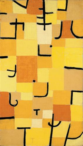
Perhaps my favourite piece from Klee is his "Characters in Yellow" (1937) shown a the left.

These look to me like Japanese characters and in that the work is rather suggests to the European audience anyway - look, here is something that is using a new vocabulary.

It's a visual vocabulary of colour and shape. Or at least the building blocks of a vocabulary, like the letters which build a word or a phrase.  The palette of warm oranges and yellows contrasting with the black lines (more stained-glass influences?) and say something different than if he used another part of the colour spectrum, and chose other characters. What the colours say to you, and what the characters say to someone else, each viewer is different, and brings a different set of experience, culture and knowledge to a situation.


Clothing manufacturers for years have borrowed from the Klee body of work. Probably almost as much as they do from Mondrian.


The other, related, thing that keeps striking me is that his art should be adopted by a quilt manufacturer.   Indeed, modern quilt makers are often rather decent artists in their own genre.  The colour, abstraction and geometry used by Klee a century ago must surely appeal to people that work in that art form.

There are many examples I'd like to pull up around my ears on a cold night.  At left is "Red Balloon" from 1922


Klee dies in 1940, from an degenerative tissue disease that gradually saps his strength and ends his life.  He still creates some important pieces in his final year.   His music-teacher father also died that year, I notice, though I don't see any detail about the timing between the two events.

Paul Klee's  "Chosen Site" from 1940 is another strong piece from his final year.  A landscape composed of the sorts of forms and colours he explored in earlier years and a heavy red sun at the end of the day perhaps.  His colours are much more muted here, from those years of glowing vibrant stained-glass-like compositions.

Klee leaves an amazing legacy - a large number of completed pieces and a style that continually evolved.  One has the sense of flood of inspiration that he would never manage to get through exploring before time ran out.


Monday Morning Art #17 - Jackson Pollack

Over a short, energy-filled career, Jackson Pollack evolved quickly from swirling representational creations into abstract explosions of colour and texture.  Through the late 40s and the first couple of years of the next decade, he created works that are quickly recognizable as his, even by those with only a passing familiarity with his work.

 His 1935 piece "Going West" is a swirling mid-ground between a Van Gogh and an Elvis-on-Black-Velvet.  The range of values is interesting, though, from very dark blacks to the glowing moon, and highlights on the horses. We'll see elements of this later.


 He also does some work that shows influences perhaps of Kandinsky and Klee. This piece is called "Blue Moby Dick" (1943).


His style here has elements of naive, surrealist and abstract.  Here's an untitled Kandinsky from about 1910, for an interesting comparison.


But the exploration - or perhaps evolution - of style continues. This untitled piece as well is an interesting one.  The palette, the shapes, and movement.  


 While I'm playing this-looks-like-that, I'll note that that one reminds me of Marcell Duchamp's Sad Young Man on a Train, shown below, on the right:


Pollack gets into a full-on rejection of careful brush strokes on an easel-mounted canvas, and gets into his energetic, full-contact painting method.  Canvases on the floor and paint flying, he creates works with depth, and motion and colour that manage to engage and appeal.


The piece above is his "Lucifer" from 1947.  Best seen large (click on it for bigger) and in-person, but even at this on-screen version you can see some of the depth and malevolence in the spider-web-like black and the tendrils of plant-like green.

He gradually abandons naming in favour of numbering. An understandable position as he lets the viewer decide what is represented.

Here is his Number 5, from 1948.  Again, a very small reproduction here. Hopefully it looks pretty good on your screen.


There are a bunch of more pieces I'd love to share here, but doing them justice requires making them rather large, so perhaps I'll not get too carried away.

It's worth searching your favourite image search engine for more pieces, or click a few of the links here for some of my favourites, like his "Convergence" or "Full Fathom Five" or "Shimmering Substance."

A late work, his "Portrait and a Dream" is also notable in that it signals perhaps the beginning of another phase in the artists direction. One that sadly wouldn't have time to develop before his exit.

That late piece "Portrait and a Dream" was finished in - 1953.  Here's an (NPR) photo of the artist, and painter Lee Krasner (also an artist), and a guy with a pipe, looking at the finished work.


Also interesting, and tragic, is that Pollack had been exploring sculpture as a medium in the mid 50s as he approached his tragic end.  He was only 44 years old when he foolishly lost it all by driving drunk, killing himself and a friend in the process.  A mistress survived the one-car accident and (at last notice) was still alive in 2015.

I'll wrap up with perhaps my favourite piece, his "The Deep" from 1953.   For me, it's a look through  frosted pine trees or perhaps into a deep glacial crevasse.


Monday Morning Art #16 - René Magritte

"Everything we see hides another thing." -René Magritte

Quickly moving through Impressionism to Cubism in his early years, Belgian artist René Magritte is an icon of the Surrealist movement.

Magritte comes from a troubled childhood, with the suicide of his mother when he was 12, and then the First World War in his mid-teens. These troubled years feed into his work for the rest of his life, questioning reality, how we see the world, how people interact, and the very meaning of art and painting.

Drawing a lot as a child, it becomes his vocation. After serving in the post-WWI infantry, he becomes a draughtsman in a wallpaper factory in his early twenties, and works later designing advertising and posters.

This very cubist influenced work here, is from 1923, entitled 'Youth.'  This was created shortly after his military service.

Magritte's commercial art origin is not unusual for iconic artists, it seems. The demands of commercial work seem to do something to focus the artist's composition, and teach them to pack a lot of content into simply structured images, that can make an impression quickly.

An important skill in a successful artist is when they can depict that a depth beyond a first impressions.  A work becomes even more impactful when it challenges us to question what we see in the painting and even the 'ordinary' world around us.

This piece at the left is entitled "Modern" and places a figure in an abstracted urban scene.  A somewhat unsettled pose seems understandable from a twenty-something finding his way in the inter-war period in Belgium.

His work continues to explore what reality is. Deconstructing the perceived veneers of the world around us.   From layers of reality stripped away, as shown below. Other pieces depict foreboding eagle shapes in enormous looming mountains in his late 1930s work.


This piece from 1926 is called "Popular Panorama" and depicts cutaway layers of reality that illustrate a separation of peaceful - yet somewhat ominous - natural environments separated from the modern world in which we all live.

By the 1930s Magritte has mostly found his trade-mark style. Crisp realist, somewhat flat, portrayals of reality, with a twist to make us question how we look at the world.

He plays with our perception of how art fits into our lives and what purpose it serves for us.  He finds that a landscape devoid of figures can ask us as much about how we live in our environs as another asks with a figure placed prominently within it.


Magritte's 1933 work called "The Human Condition" considers how we look at the world through art.  He has a number of pieces that depict a pastoral view recreated in a realistic painting, yet situated in the very environment in which it was created.  Perhaps a bit of a jab at landscape painters and realists?  Was that view edited perhaps? Are we really seeing reality, just because it seems like a faithful reproduction?


"Why do we choose to capture the world on a canvas as it actually is, rather than just look at it in real life?" he seems to ask.  Where is the challenge? How are we examining the human condition when our art is just pastoral landscapes?

As early as 1927, Magritte begins with his questioning of what we see and feel. In his "Interpretation of Dreams" piece he seems to do that.

I disagree with some reviewers' claims that he was exploring how objects connect with disparate things in our lives.  I see this piece instead making a jab at pop-psychology and psychoanalysis.  These random items, with their incongruous labels,  as if in a museum display case, evoke a disbelief somewhat similar to that a skeptic feels hearing about Freudian dream interpretation.   

You dreamt about a leaf perhaps? Well that represents a table in your life. A briefcase? That's the sky.  A sponge? Well that's just a sponge.  Wasn't it Freud that said "sometimes a cigar is just a cigar?"

As war approaches, the foreboding creeps into his work.  In one piece, that gets later recreated in many variant forms, large, oppressive mountains loom over the scene, with small eggs or other objects sitting on a building ledge in the foreground.


Perhaps his most foreboding piece is "Black Flag" created in 1937.  Somewhat referencing the Futurism of the early 20th century, but hinting too at dark days to come.


Magritte remains in Nazi-occupied Brussels during WWII, evolving his work into somewhat less attention-drawing period sometimes dubbed his "Renoir" period, with some very similarly styled pieces, yet still with that surrealist edge.

A theme in many of his war-period pieces is the use of birds.  Owls are depicted, as are doves in flight. The imagery in those subjects is suggestive - quiet watchful waiting;  the yearning to be free. An optimism even, particularly in the late war years.

In the post war period Magritte seems to pick up where he left off, making us question reality. Asking too, perhaps, why do we believe what we are fed in the art and media around us.  For an advertising/poster guy living through a propaganda-filled period, this question must be a dominant topic during the war.

One of Magritte's most discussed messages is embodied in his famous "This is not a pipe" statement, with a crisp depiction of a pipe.

But that's absurd, his audience exclaimed, it's clearly a pipe.  When pressed with that, his reply was simply, "well try to put some tobacco into it."  

Again he challenges us with the question of what is reality. What are these things we call paintings, and why do we choose to depict the things we do.  More importantly, why do we accept the things we are told in various media to be true or real at all?

Magritte continues to place figures in his views of our world, and continues to obscure the faces.  Not only does this create mystery about identity but allows us to perhaps put ourselves into the image.  We ask who are we, and how do we fit into this (on the surface) familiar world.  "Everything we see hides some other thing," he says.


Perhaps Magritte's most iconic artistic element, or device, is his man-in-the-bowler-hat.  It seems he first appears around 1951, with the piece "Pandora's Box" where the figure crosses an urban bridge, with a the lure of a perfect white rose just in front of him.  The title suggests that what he will find on the other side of the bridge is not what he might expect.

Many depictions of our bowler-hatted friend appear in subsequent years.  Turned the other way, or with his face obscured by flowers or fruit, he shows up time and again.  Clearly a device that resonated with Magritte and his public.  Most exhibitions to this day feature this element.

This piece is "Decalcomania" from 1966. 


René Magritte died in his native Belgium at 68 years old, in 1967.


Monday Morning Art #15 - Ivan Kramskoy

During the mid-to-late 19th century there was a portraitist of prodigious skill.  Perhaps 100 years before his time, or maybe a Russian Vermeer?  Ivan Kramskoy was part of the group known as the Itinerants, intellectual, activist artists who valued realism in their work, and achieved a high level of proficiency.

Kramskoy's portraits really shine, but he depicted some people in the natural environment as well.  This view of a lady named Vera Tretyakov walking a forest path is an interesting picture to lead with.  It is, in someways, a contrast to the portraiture for which Kramskoy really shines. But there are some parallel skills shown here. The ability to capture the light and atmosphere of the space under the vegetation with an economy of strokes, for example.  If the artist had been more taken with landscape as his focus, it would have been interesting to see where it would lead.

Indeed in the Itinerants group, several members feature figures in the landscape, though the figures are usually more dominant centres of attention, and the landscapes, while faithfully rendered, are not as atmospheric or 'magical' as Kramskoy's. 


The subjects in his landscape settings somehow capture subtle a sense of movement, too.  You almost expect an arm to lift or a head to turn.


His colour palette is usually consistent as well.  The translucent green of sun-through-leaves appears to be a favourite.

This piece, a couple On Balcony at Siverskaya (1883) not only captures the summer's day well, it reminds me that the mowed-lawn is much more of a modern obsession.  They are people living in the landscape rather than dominating it.


Looking at the other members of the Itinerants for a moment, there are many who deserve attention.  One notable is the artist Ilia Repin who did large, slightly over-the-top, Cecil B. DeMillesque tableaux.   Moments in history, migrating peasants, labouring hoards, that sort of thing.  Quite pleasant to look at and note the complex, multitudes each with their own expression and activity.


There's also, the engaging Valentin Serov who was a skilled portraitist in his own right. Serov perhaps even incorporates more personality in his works, embracing the free feeling of a quick sketch into his finished works.  Certainly he captured a wider range of emotions, often joyous ones too, if not an equal depth to that Kramskoy captured. (A future Monday Morning feature?) But one cannot deny the striking gravitas of a Kramskoy portrait over all others.

This portrait of Dr Rauhfus (1887) is one that perhaps has some of the feel of Serov, in its contrast of roughly sketched, and precisely completed elements. (Or maybe it was just unfinished ;)


In the 20th century there was the Photorealism movement, born out of Pop Art in which Kramskoy and Repin and some of their Itinerant contemporaries would have felt at home.


I don't have a good sense of Kramskoy's biography. It's clear he spent some formative years in France, as he has a handful of landscapes around Paris. The 18th and 19th century Russian love affair with all things French can easily explain that.  The influence on his work comes through clearly though as well.

The French landscape painters of the mid 19th century were still doing classical pieces full of mythology and religion, but would lay the groundwork for impressionists like Cezanne, Seurat and Monet.  Kramskoy seems to have picked up on some of that. And while his portraits are near photo realistic, his landscapes have an ethereal quality, and interpretation that his people do not.  They look to my eye like he may have been on to something, but didn't really develop it, as portraiture consumed him.

Now on to his portraits. There are two very arresting pieces that first brought my attention to Kramskoy.  First was his self-portrait of 1867.  Many his self-portraits are very good.  He may be, at least to my taste, among the greatest self-portraitists in history.

In this piece of the artist at thirty years old, one can easily imagine him as a contemporary figure.  Here, as in all his male portraits, Kramskoy shows a mastery of hair.  The big bushy beards of peasants and working class (see further below) are always meticulously and captured. I find it interesting that he could master such a photo-realistic approach to beards and tousled hair, yet works with such an economy of strokes and an impressionist feel with vegetation.  Both are surely of equal complexity.  The latter, I suppose, is more forgiving in terms of criticism by the viewer?


Oh the second of his most arresting portraits on my list,  among his best, are two 1883 portraits of the same unknown woman shown below. 

unknown woman 1883


This first one seems to be more of a sketch for a later finished work, which I've also included here, below.  The expression in the sketch is a bit more natural and sympathetic. There is a more natural colour in her cheeks from the cold, and her hair pulled up out of the way, but there doesn't seem to be a hat involved.

A different facial expression now. Similar, but now a little more haughty. Her makeup a bit more powdered and formal, and clothing more dressy as well.  She's headed for the opera, perhaps?  The setting and face seem rather French to me, but who knows.  Could just be that on-going obsession with Parisien culture.

Let's go extra-large for this formatting, and let it spill over the template a bit so we can enjoy the misty setting more easily.


A smattering of other portraits to include now to convey Kramskoy's best.  Two other stand-outs are these that follow, depicting the lower-echelons of Russian society.   As an activist artist and intellectual, born into humble means, he shows an affinity to the common people.  We all know where the outrage at the plight of poor Russian peasants leads in the next couple of generations. 

The Peasant from 1868 gives us a humble looking fellow with a prodigious beard.  His hair looks like he may just have taken a moment to wet his hand and flatten out the unruly locks before the painting was 'snapped.'  The beard belies his years, the coarse clothing his station and facing the difficult elements.

There's colour in his lower face from working in the sun and wind, and a bright forehead from a heavy hat.

His eyes look at us, but glaze a bit as he waits for the painting work to be finished.  His mind wanders, we can see a little bit into his soul.


 The Miller from 1873 shows an older fellow. He doesn't look at us, but rather gazes off across the room.

His rough coat is still cinched up tight over his girth.  He didn't get a lot of sleep last night. He's getting on in years and the heavy work of the mill is probably wearing on his old bones.

This and the previous subject with their rough hair, the scraggly beards, and rudimentary clothing, are Kramskoy's forté.  You can feel the connection with these people that are part of his activist nature.


A final piece with a similar ability to capture expression and depth.  May I introduce you to Ekatarina Kornilova, or at least as she appeared in 1880.

Kramskoy is in his early forties at this point.  Ekatarina seems a little nonplussed at sitting so long for her portrait.  She's putting on a brave smile occasionally, but mostly a bit tired of the chair.  Kramskoy captures her 'in-between' face, showing us a bit of the fatigue, and eyes that are at one moment meeting ours, then at the next drifting down slightly to our right.


Kramskoy only lives to be 49 years old. Perhaps not unusual for the mid 19th century.  He dies in St. Petersburg in 1887.  He leaves a lot of crisp, engaging portraits that are as good as any we will ever see.